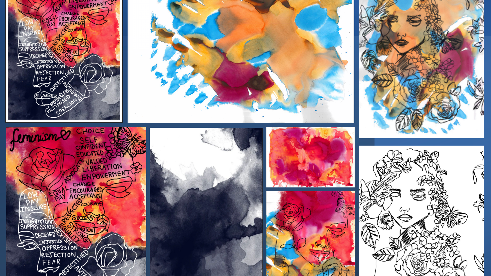
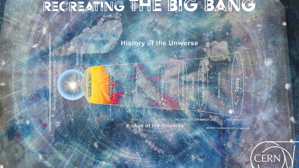
THE 'LOVER NATURE' PROJECT
The ‘Lover Nature’ project involved two climate-driven creative non-profits (Glimpse and Purpose Disruptors) inviting pairs of creatives from agencies like Wieden+Kennedy, Amplify and The&Partnership to create work to get young people to fall in love with nature. It’s based around studies that show young people in the UK want to feel connected to natural surroundings, but struggle due to environmental, economic, cultural or contextual reasons.
KIT STUDIO'S RETAIL IDENTITY FOR LONDON TRANSPORT MUSEUM
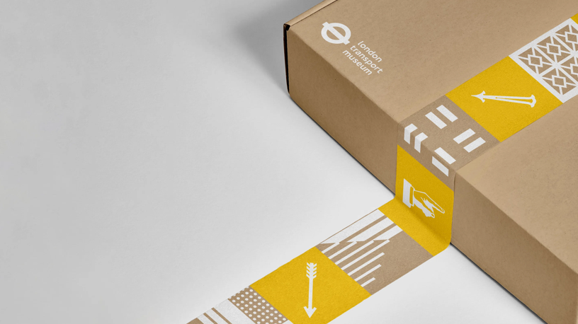
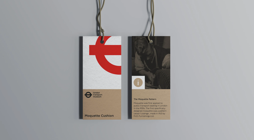
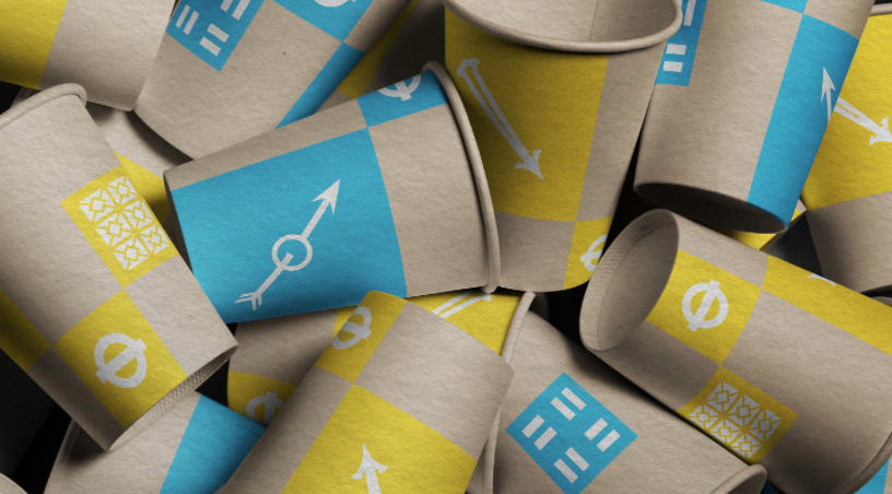
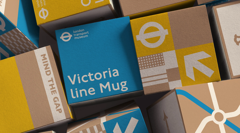

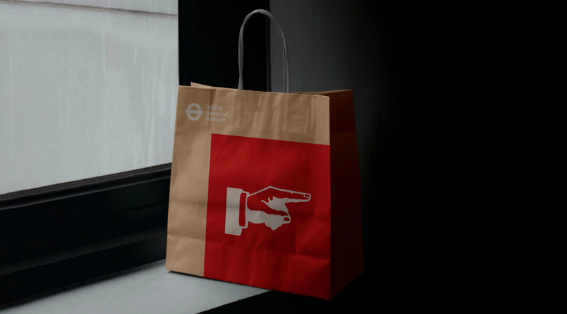
Transport Museum approached Kit Studio for a new retail identity and packaging system, the team began a hands-on exploration into the museum’s archives and displays, “tracing bus maps, and researching iconic landmarks for each tube route” to create a visual identity that would form a new design system for the store and a cohesive, yet individual uniform for each of museum’s wares. One of the Museum’s key aspects for the brief was environmental impact. They found many sustainable ways to preserve the museum’s stories through their packaging.
HAN GAO CREATES A CLEAN, CHEMISTRY-INSPIRED IDENTITY FOR A SKINCARE PRODUCT WITH A MESSAGE
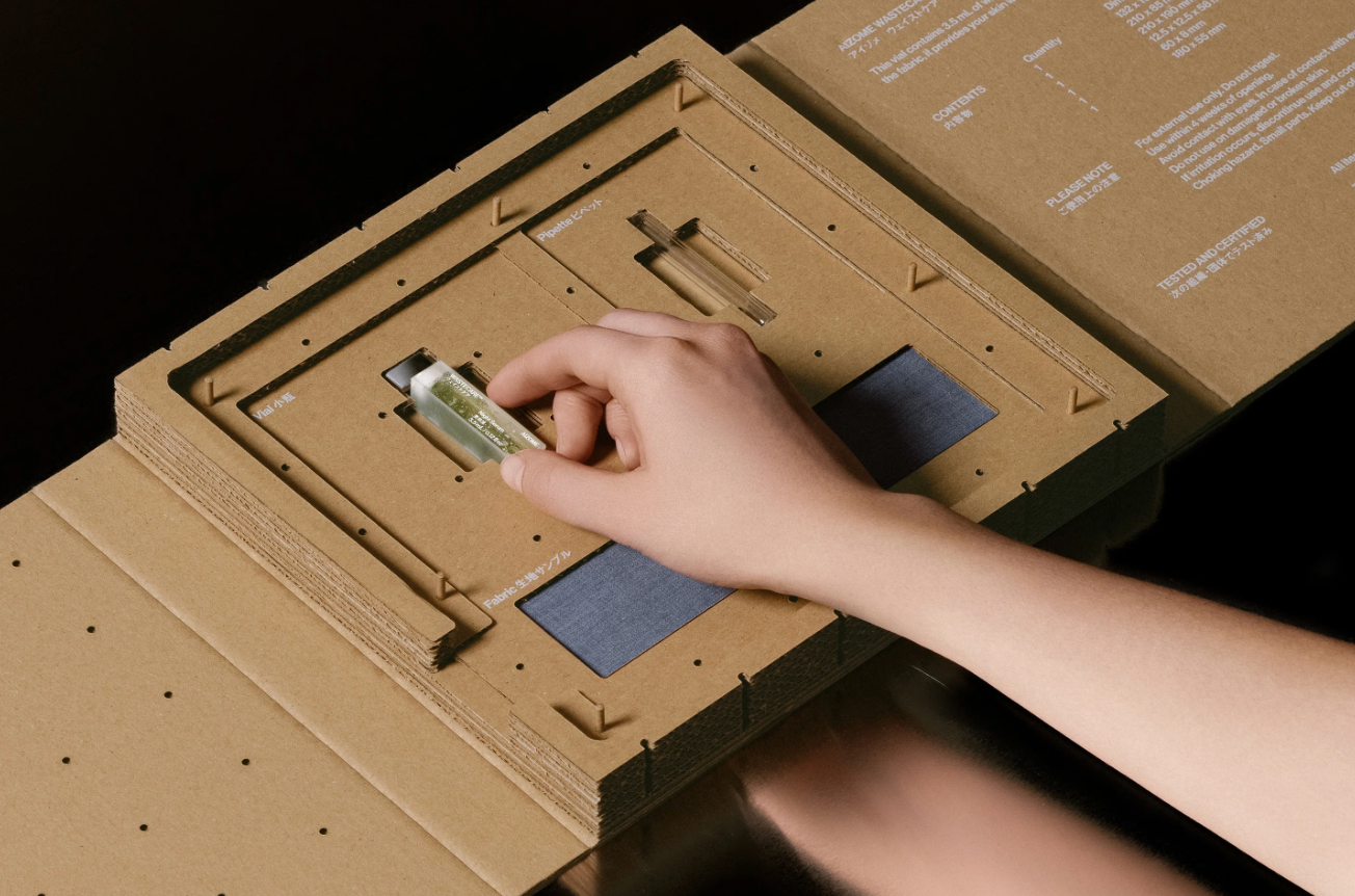
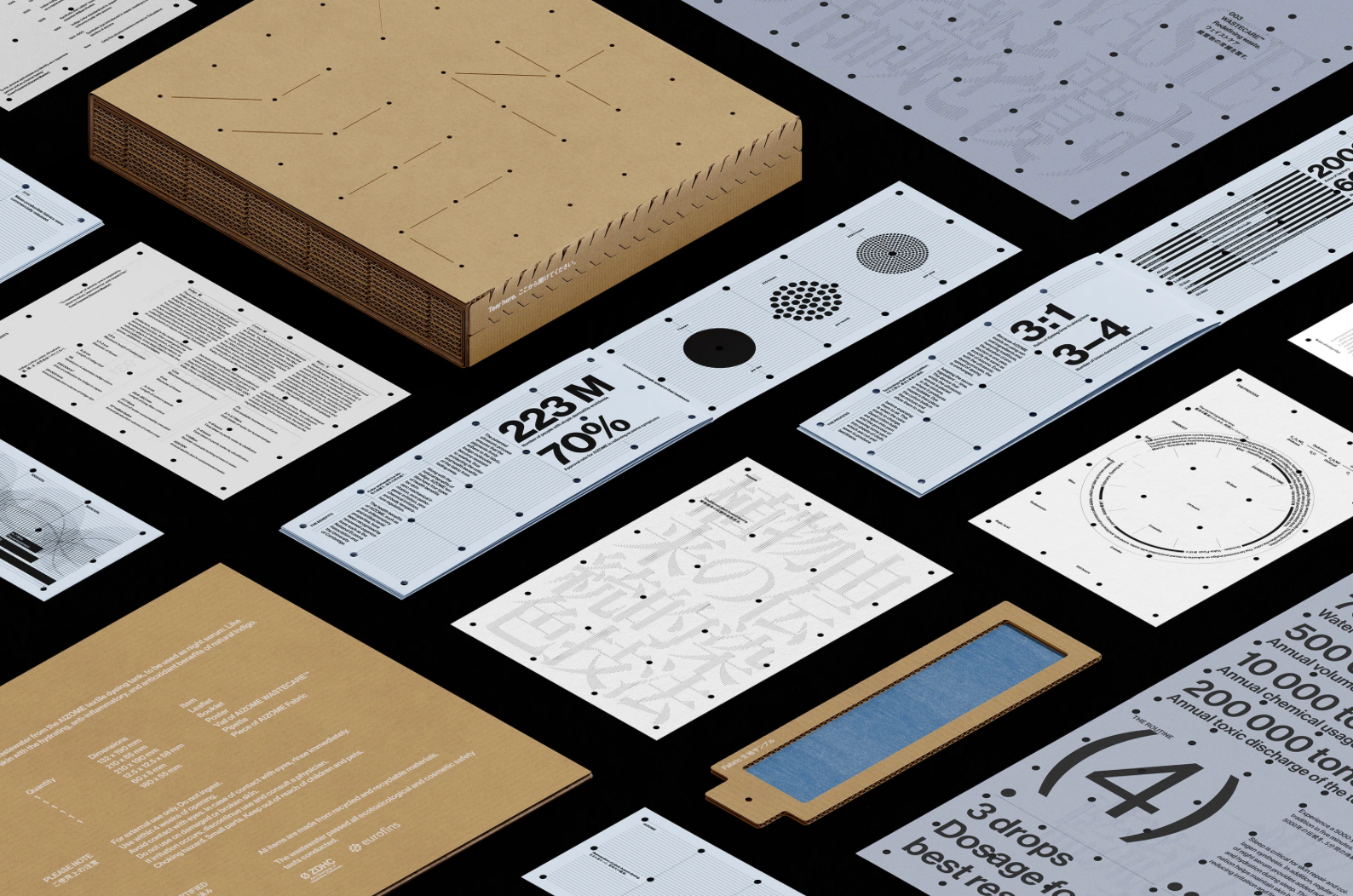
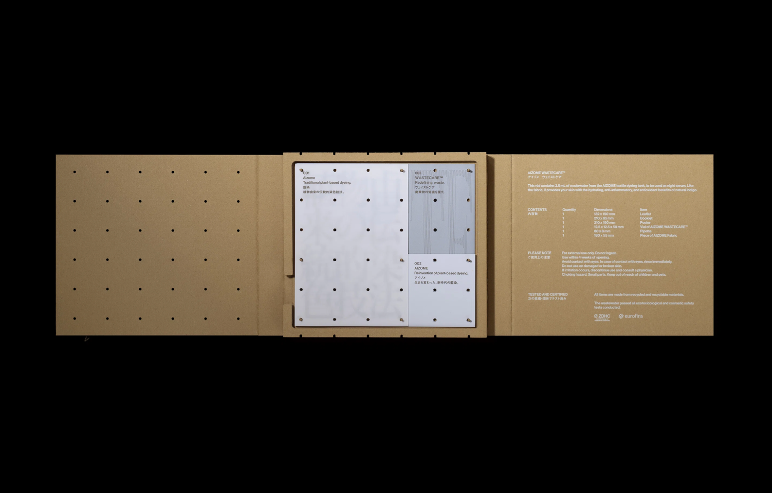
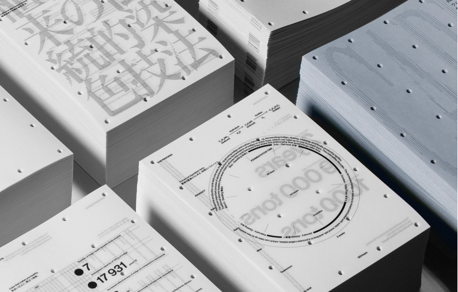
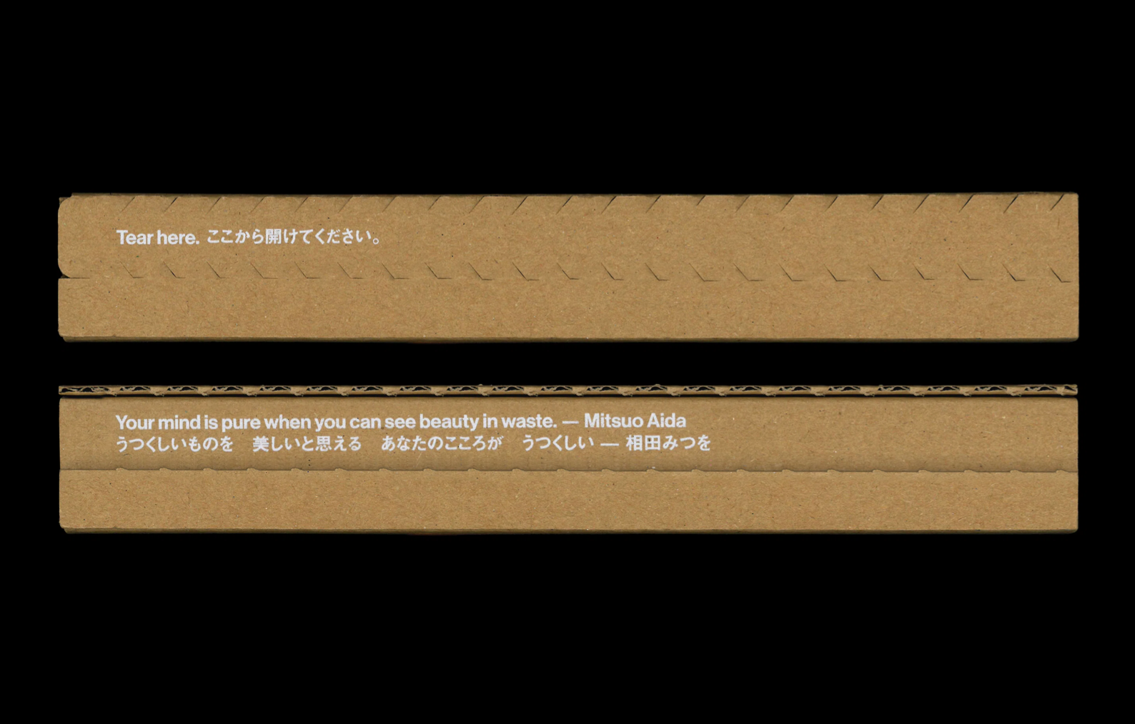
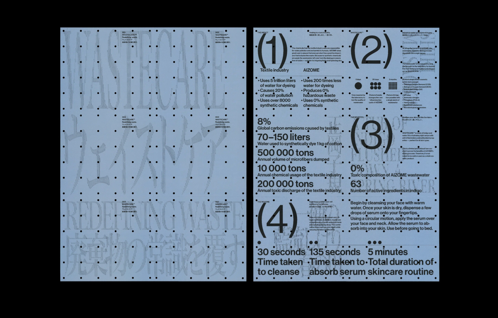
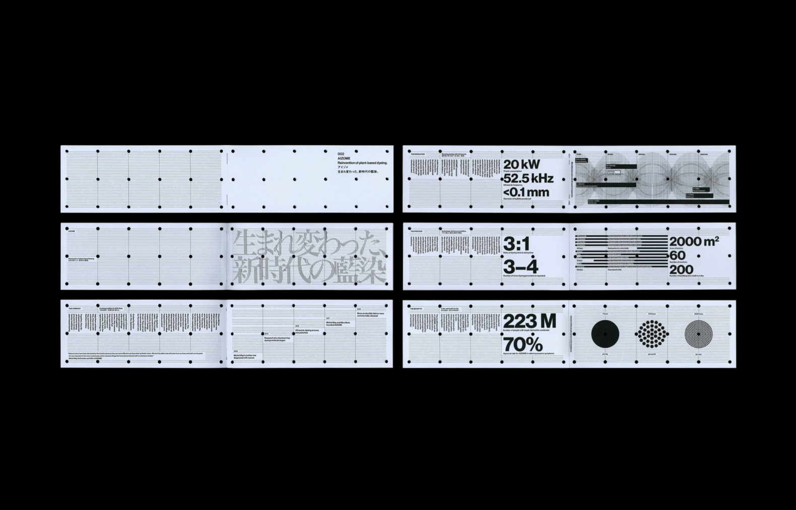
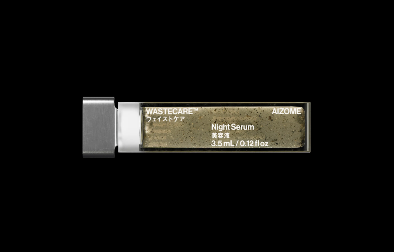
Han Goa reveals the details behind the “provocative” campaign which turns wastewater into a skincare product. Han says. “We wanted to challenge the preconception around waste and create a visual identity that reflects the value that it holds.” To create what he describes as “an unexpected presentation of waste”. He says that they opted for a “luxury look” without unnecessary packaging. “Coming from a sustainable company, every material had to be thought through,” “Both qualitative and quantitative aspects were considered to ensure a compact form factor that doesn’t need additional materials for shipping.”
"RECYCLED PLASTIC" BY STUDIO SWINE
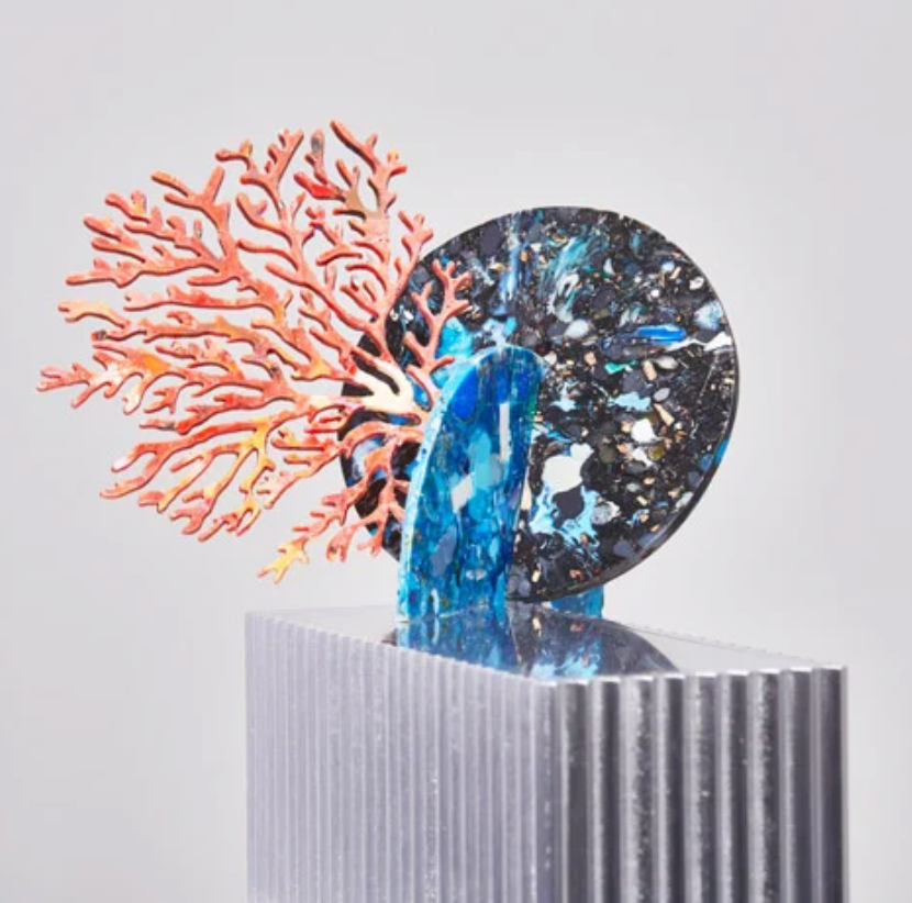
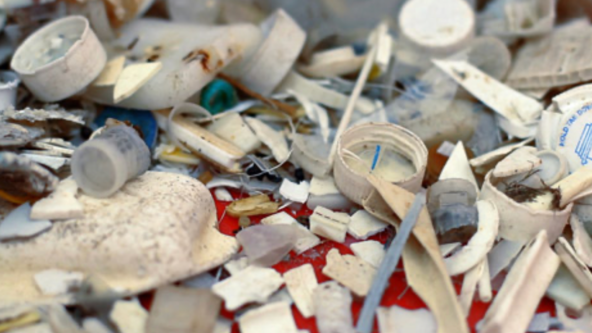
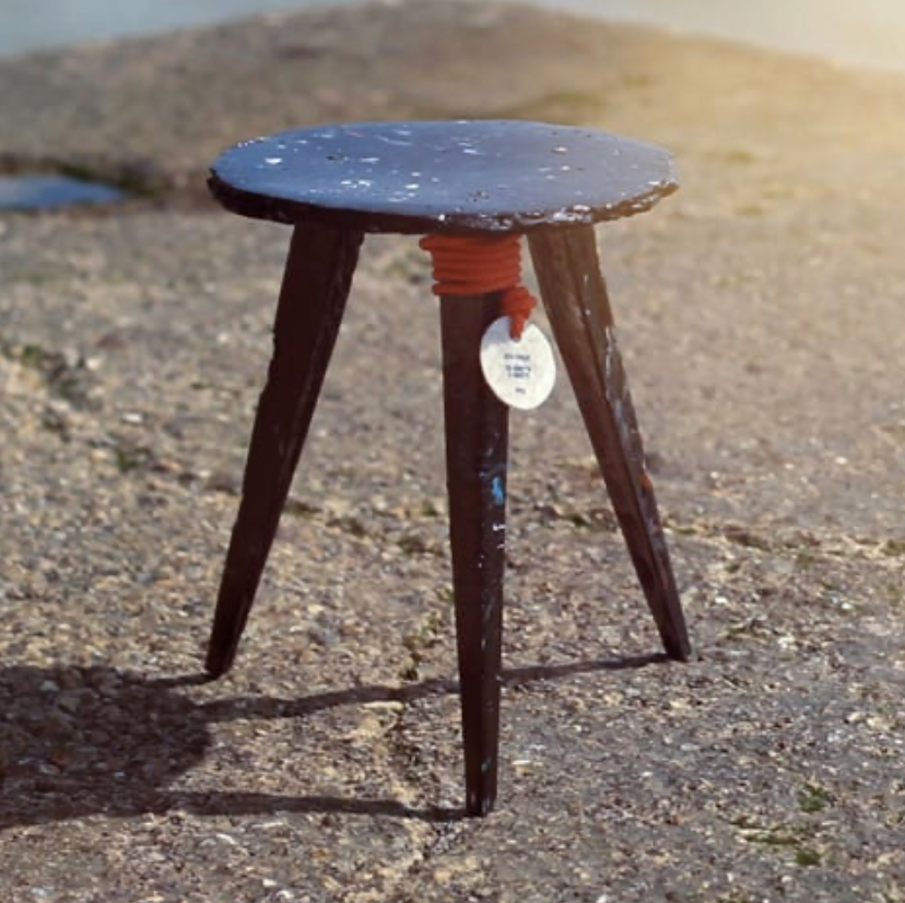
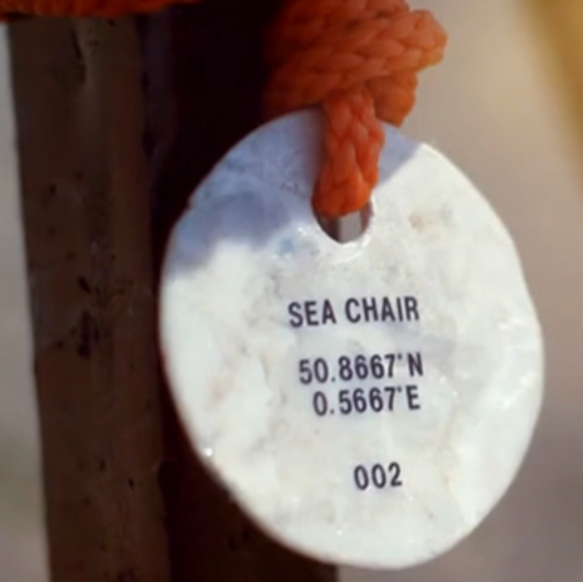
Studio Swine created a project that utilised recycled ocean plastics to make a variety of design objects, such as furniture, using a process called “ocean plastic recycling.” The project drew attention to the issue of ocean plastic pollution and demonstrated the potential for creative solutions to turn waste into valuable design products. The campaign went viral, showing that sustainability can be both functional and aesthetically appealing.
INKA - ELIZABETH GOODSPEED
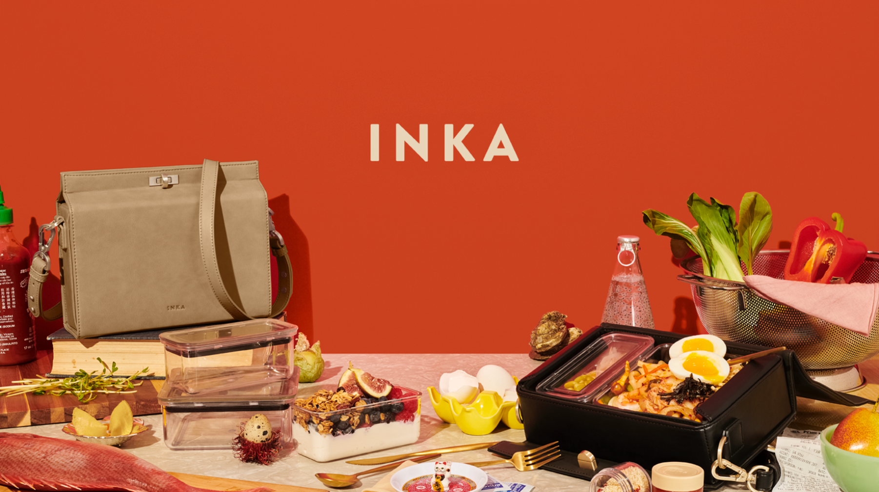
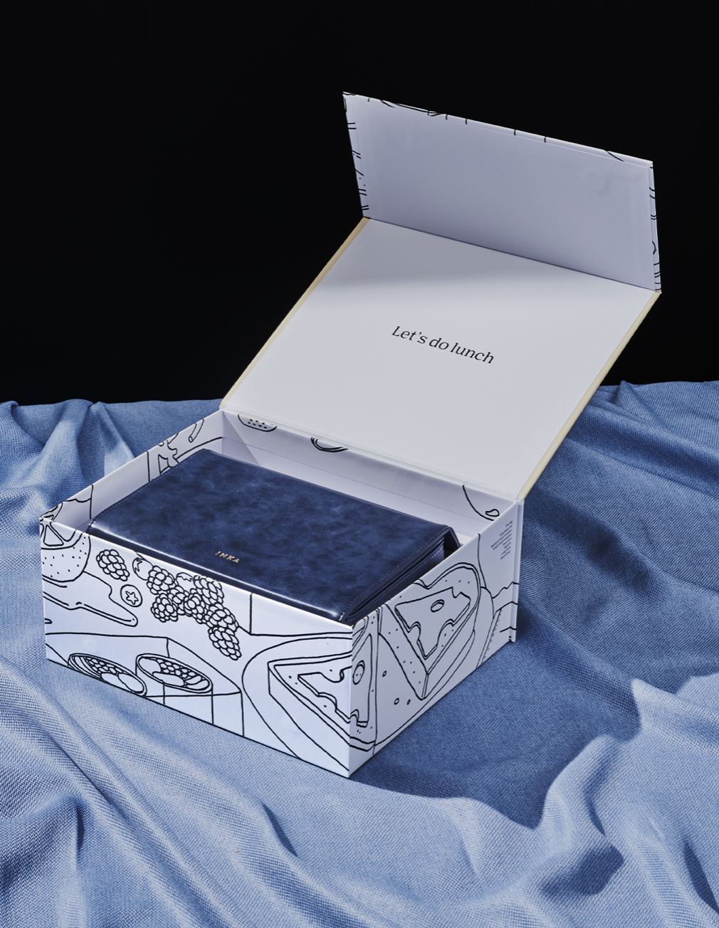
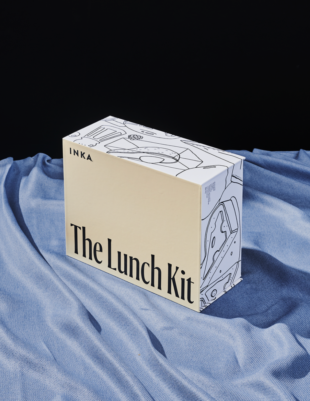
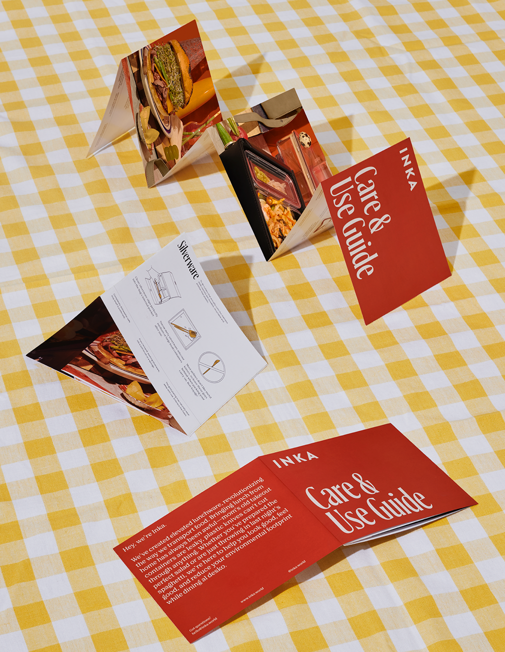
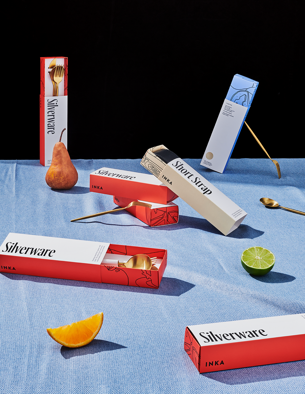
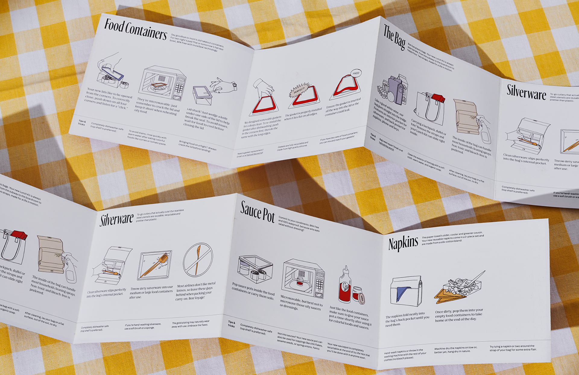
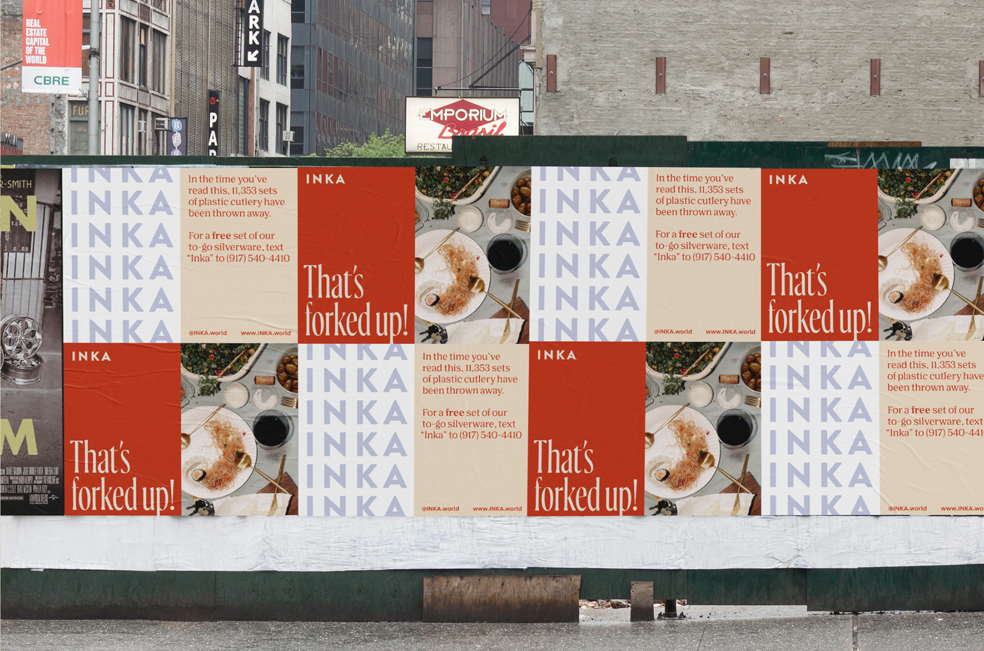
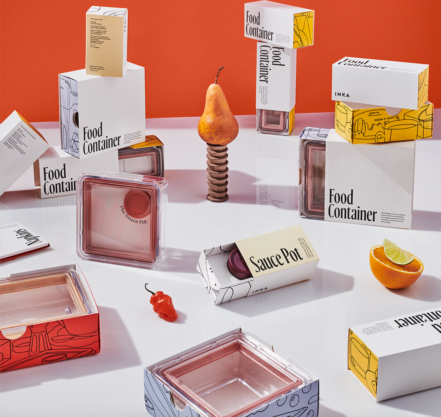
Lunch is the most wasteful meal in America, with 10 million tons of trash generated annually. While plastic straws get attention, other waste remains largely overlooked. Inka, a lifestyle brand, aims to change this by creating sustainable, stylish products for packing lunch. Drawing inspiration from the 1970s and the old-fashioned charm of reusable containers, Inka believes good things should last and be reused. Elizabeth collaborated with the founder on every aspect of the brand, from writing taglines to directing campaign imagery.
BYRON BAY OYSTER BAR & SEAFOOD RESTAURANT REBRAND - MUSE MUSE
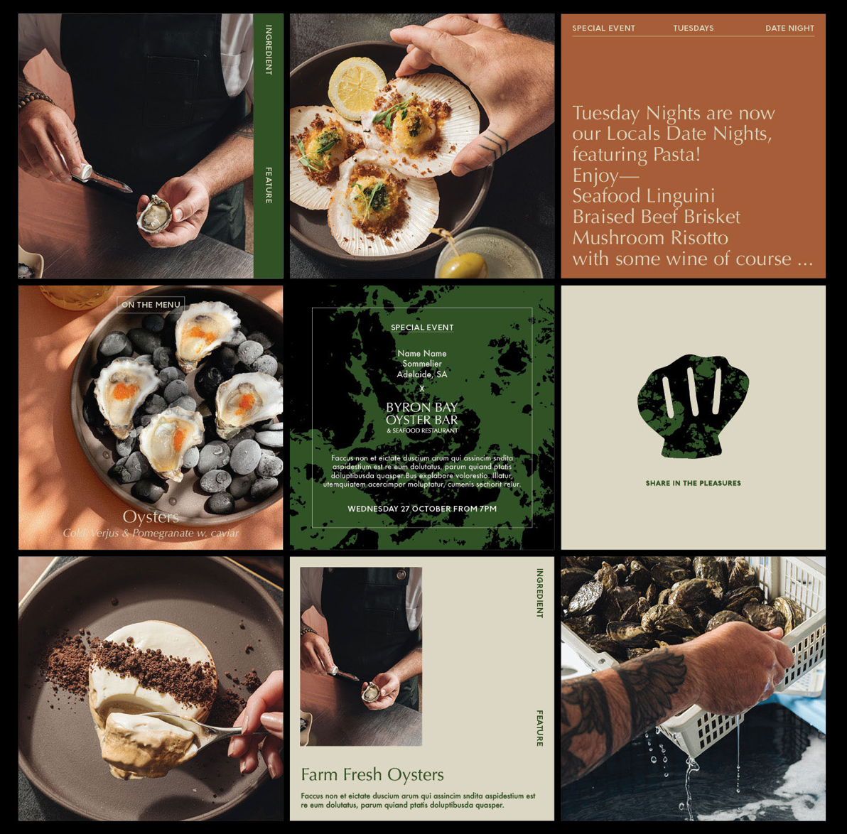
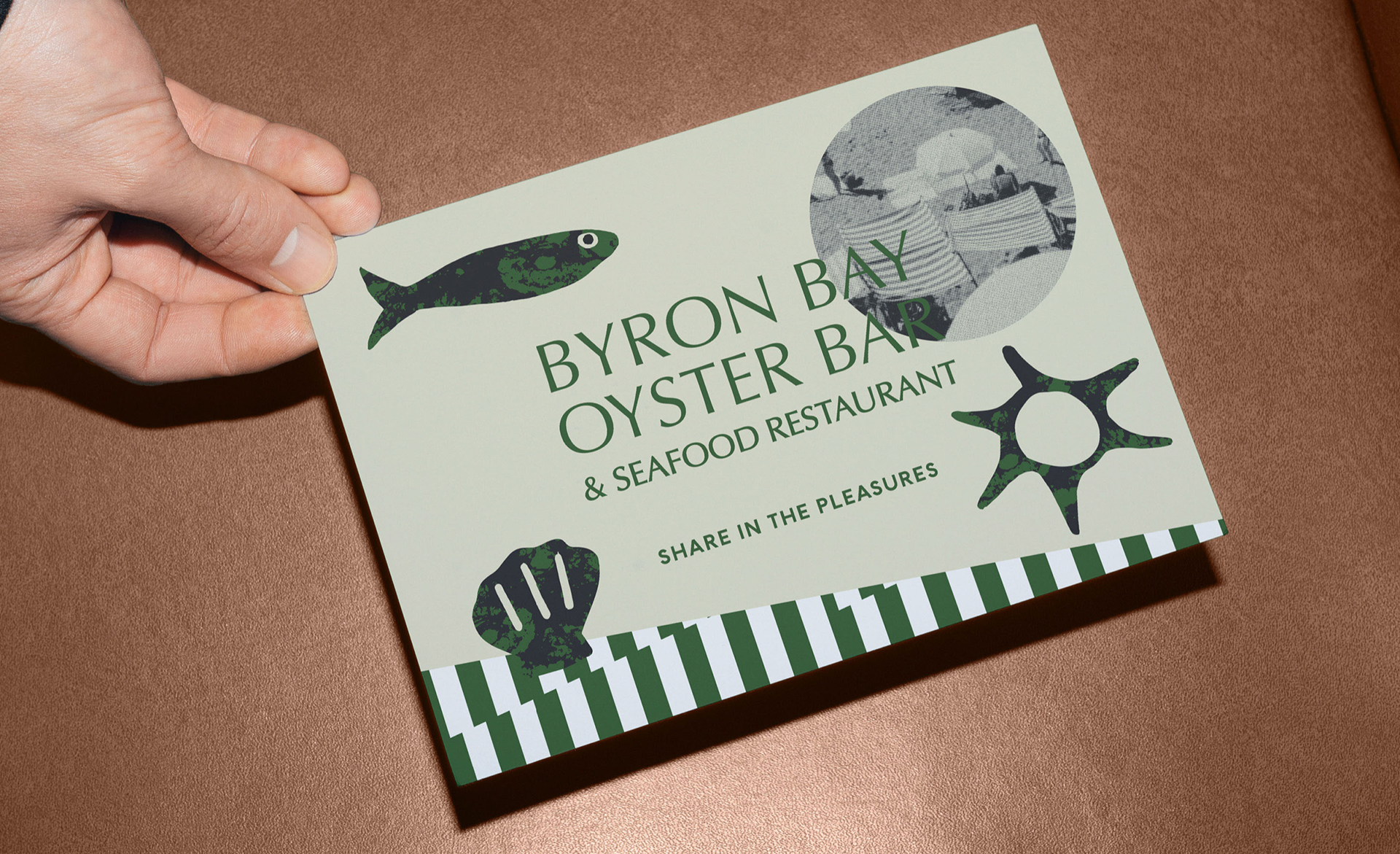


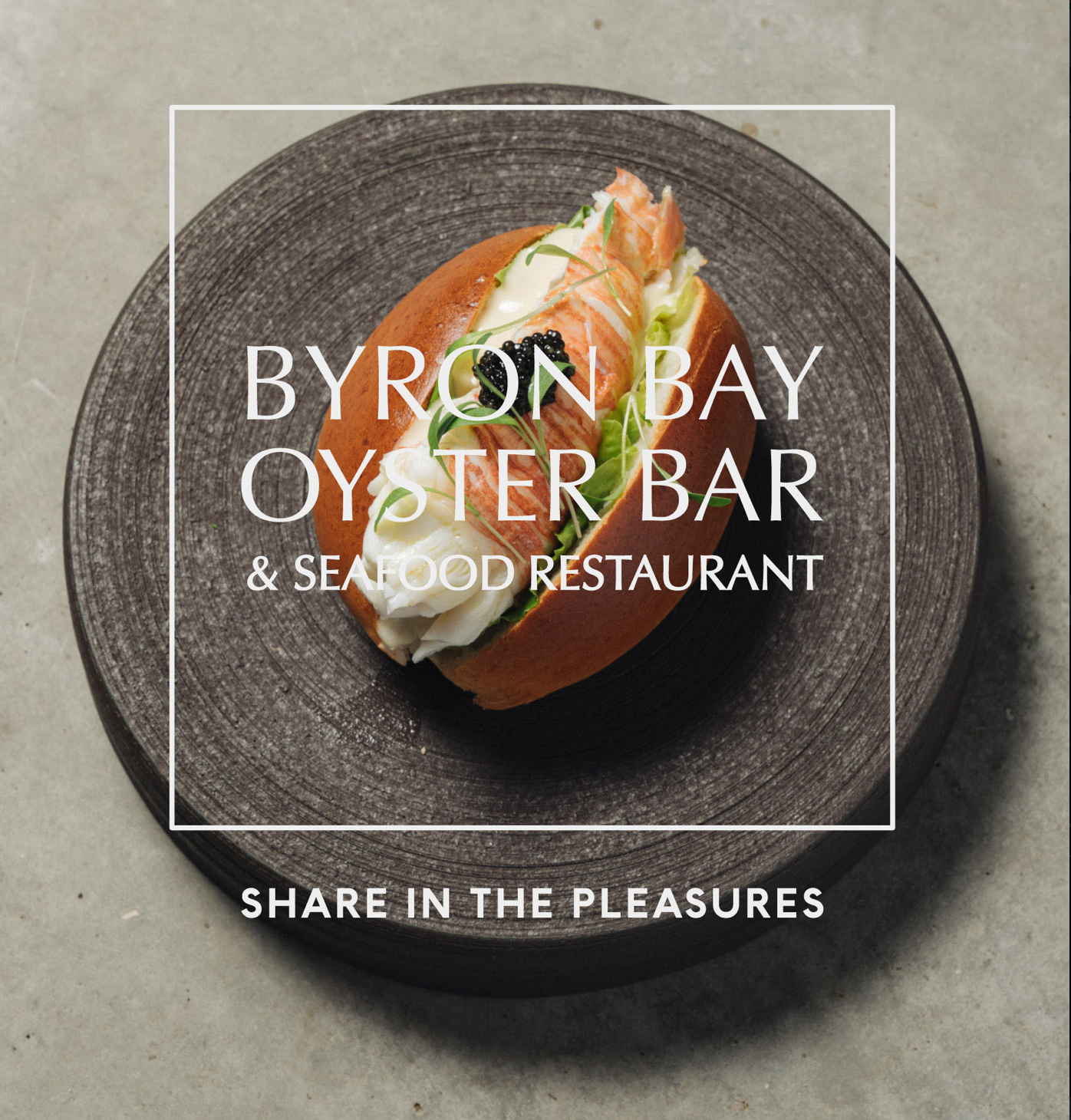
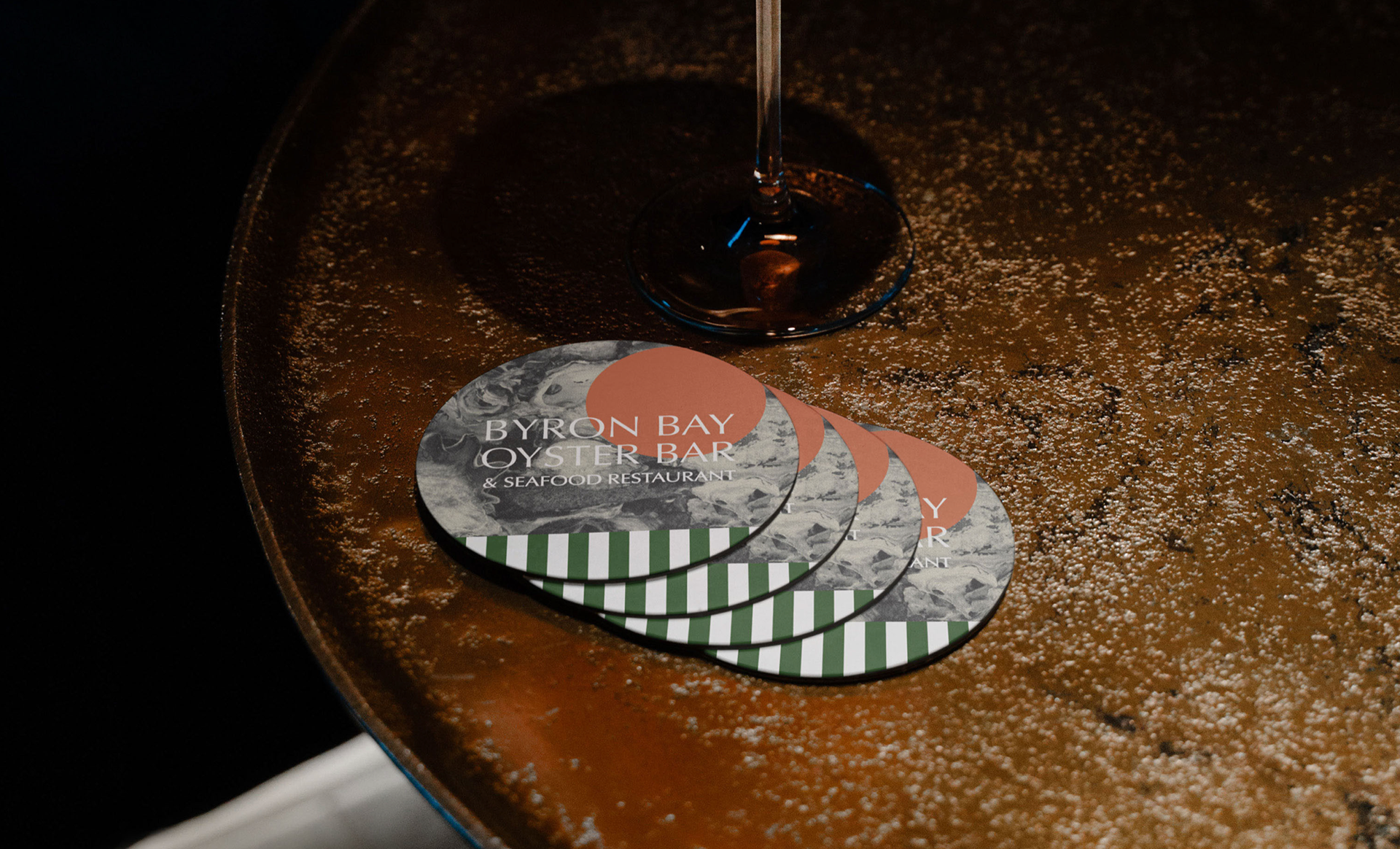
Hotel Marvell opened in 2023 with an in-house restaurant, now rebranded as Byron Bay Oyster Bar & Seafood Restaurant (BBOS). Focused on fresh local oysters, seafood, and excellent service, BBOS aims to make its mark in Byron’s food scene. The restaurant offers a memorable experience with a beautiful atmosphere, curated wine and cocktails, and top-notch hospitality. Muse Muse led the rebranding, creating a clear and aligned visual design to enhance the restaurant’s refreshed food experience.
GLOUGLOU LOGO DESIGN AND BRANDING FOR ETHICAL WINE BAR - ANDSOMETHING
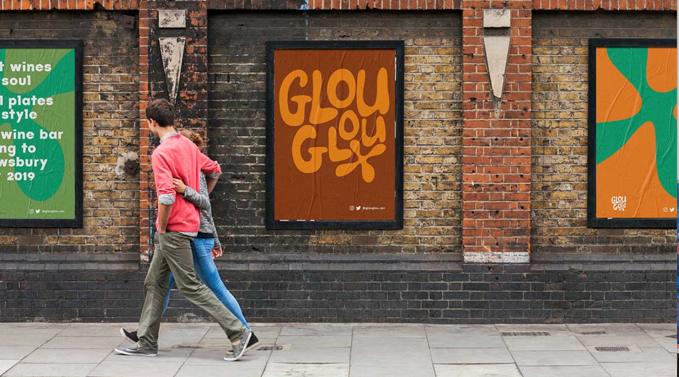
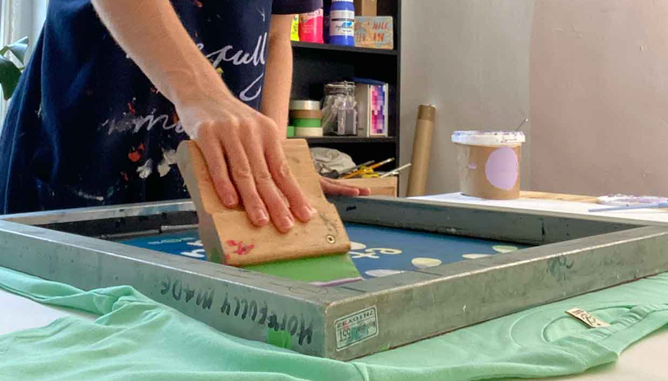
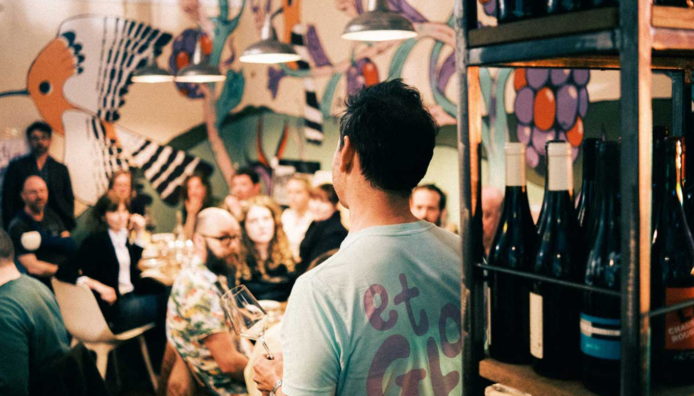
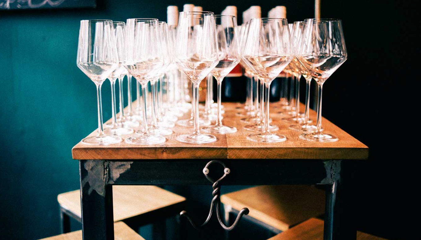
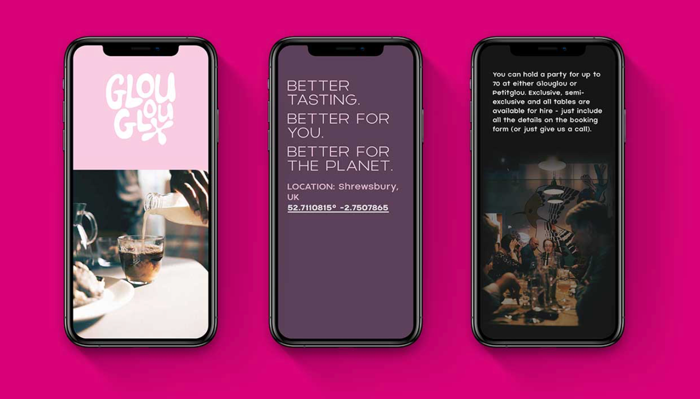
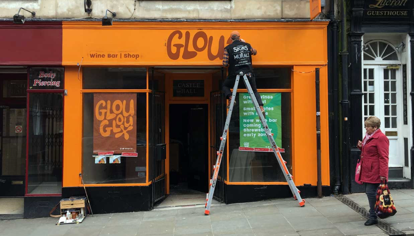
GlouGlou is an independent wine bar in Shrewsbury with a focus on environmental and ethical practices. It offers a mix of new wines, old favorites, and local Shropshire food. The branding by &something reflects the bar’s authenticity, humour, and creativity, supporting traditional producers who use age-old farming methods. Bold, fun, and authentic principles guide the design, with a hand-drawn logo, traditional signwriting, handmade furniture, and local murals. The colour scheme blends earthy tones with vibrant shades to capture the bar’s dynamic character.
EDDIE OPARA DESIGNS AN ACTIVIST, ART-FILLED CANNABIS BRAND
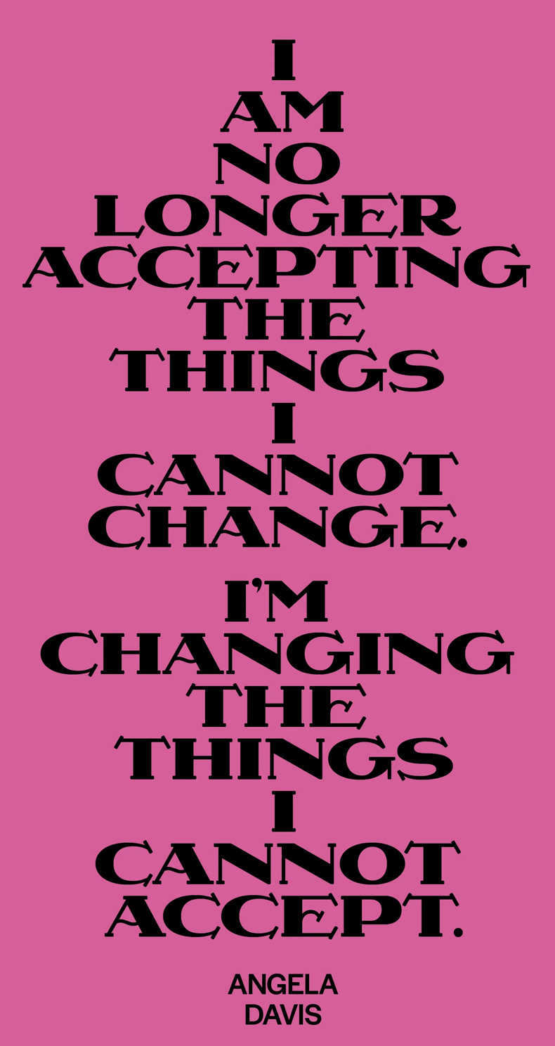
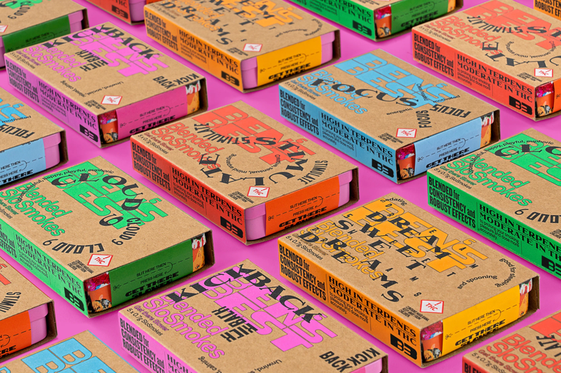
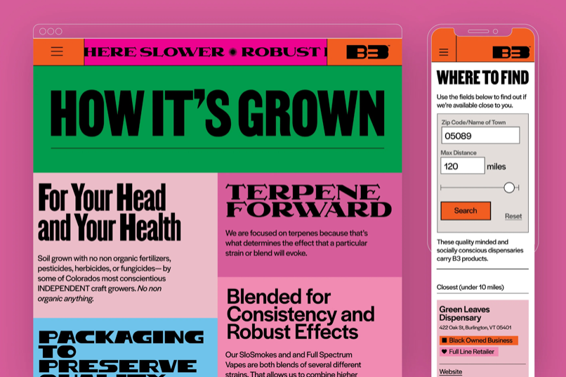
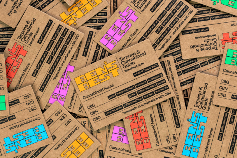
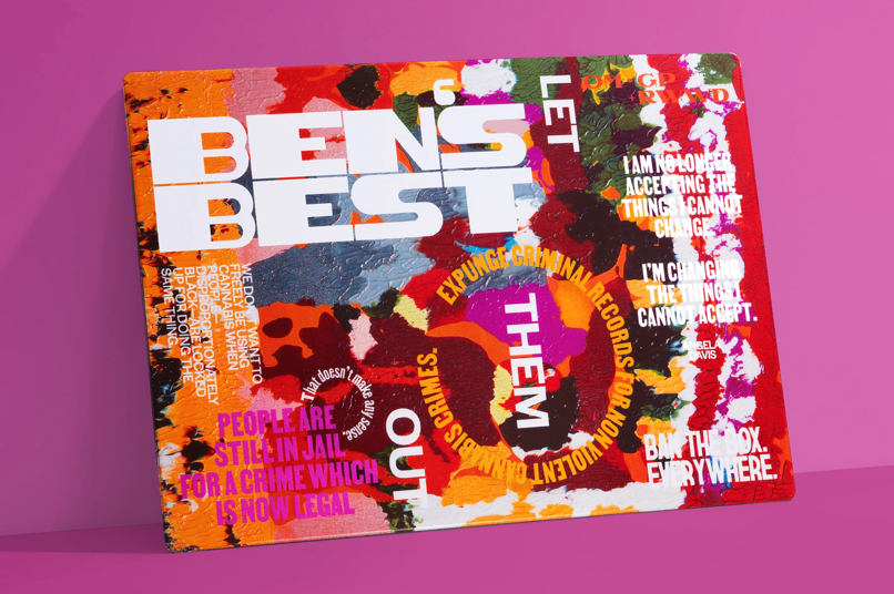

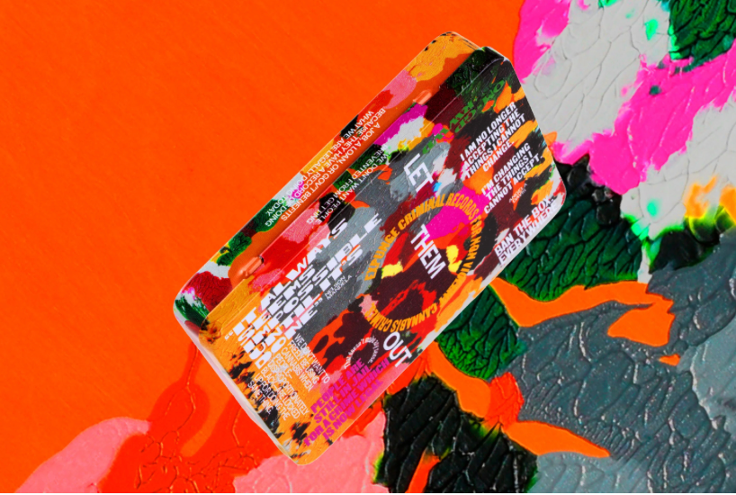
Eddie Opara's cannabis brand, Ben's Best Blnz (B3), created with Ben Cohen of Ben & Jerry’s, challenges the industry's systemic issues. B3 advocates for the decarceration of nonviolent cannabis offenders and reinvests profits into the Black cannabis community. The brand's design features diverse Black creatives and includes radical, protest-driven artwork, emphasizing social justice and equity. Opara aims to move away from stereotypes and transform the cannabis market, with the project's visual language reflecting themes of protest, sorrow, and faith in change.
TYPE OF FEELING - JESSICA WALSH
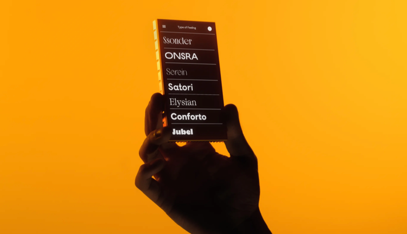
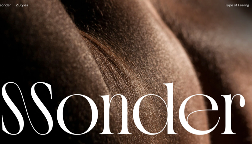
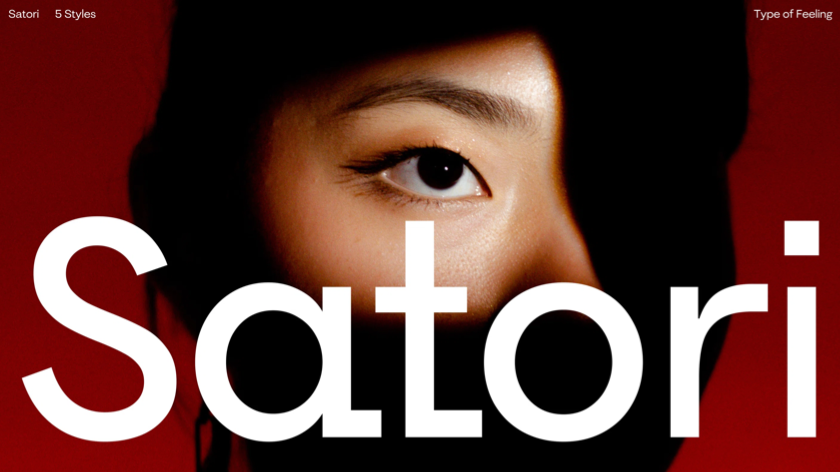
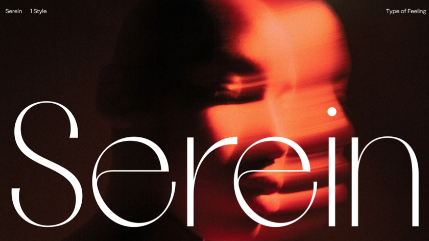
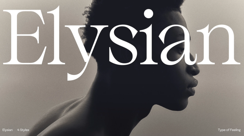
For the past five years, Jessica Walsh and her team have developed Type of Feeling, a boutique foundry focused on fonts that evoke emotions. The foundry’s catalog features fonts designed to convey various feelings, from common to more unique ones. For instance, Jubel reflects "joyful celebration," while Ssonder captures the complex feeling of recognising the individuality of others. Although the project is more of a passion than a business venture, Jessica and her team aim to keep prices reasonable and accessible, especially for non-profits. The primary goal is to generate enough sales to continue creating unique typefaces, despite the niche nature of the designs.
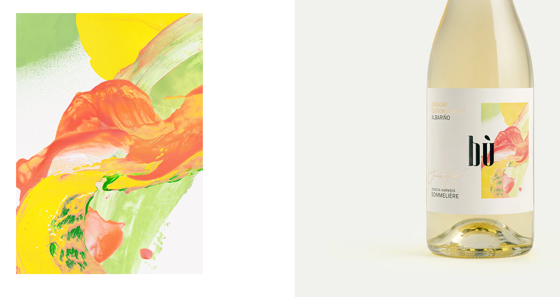
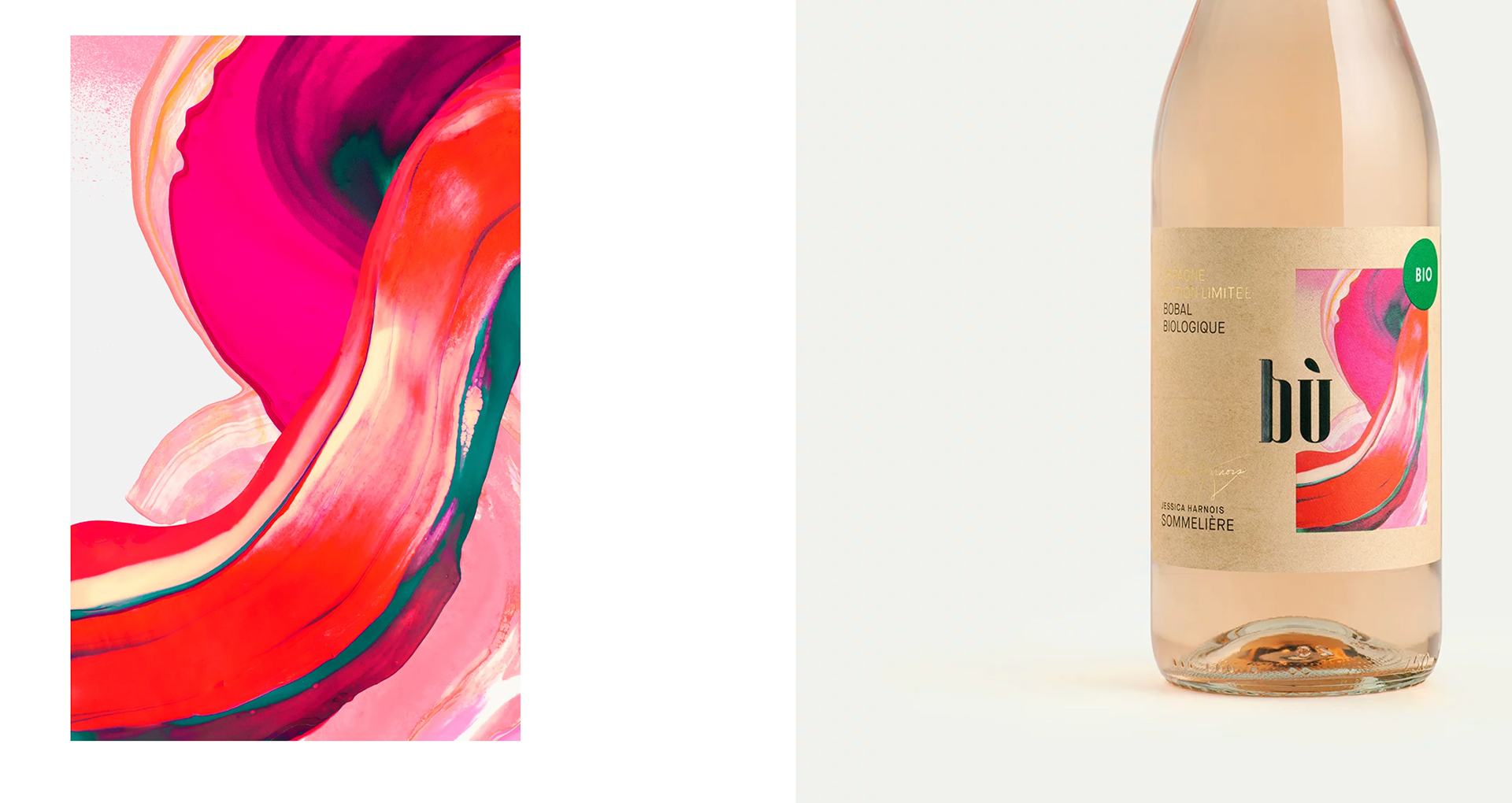
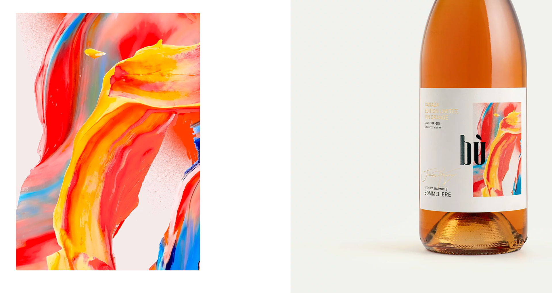
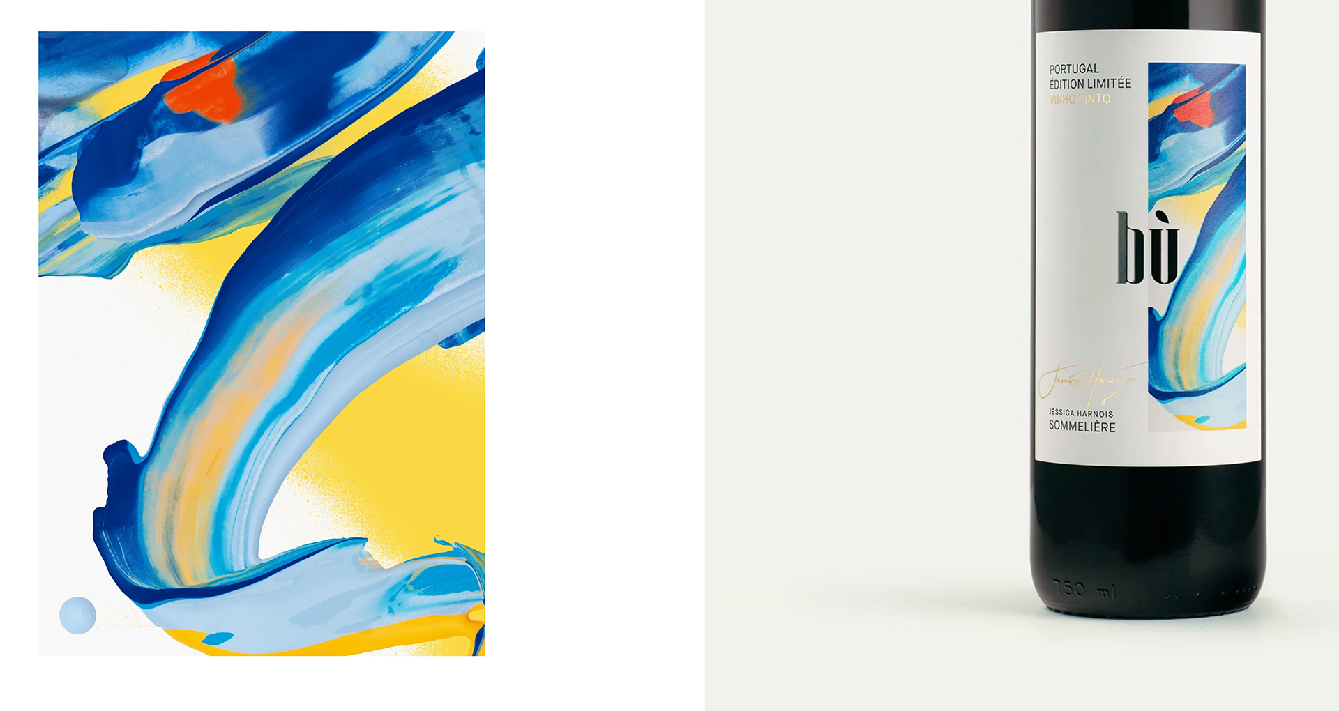
BÙ’S ÉDITION LIMITÉE SERIES - MEMORY STUDIO
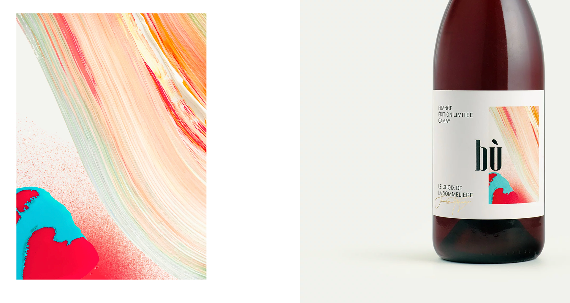
The Édition Limitée series represents an elevated tier within the renowned Bù brand, curated by celebrated sommelier Jessica Harnois. This exclusive collection of limited-edition wines is designed to distinguish itself from the core range, targeting a more refined audience while preserving the brand’s established identity. Each release is complemented by original artwork, carefully painted to capture the unique character and story of the wine.