THE UNIVERSITY EXPERIENCE
-COLLECTION OF WORK
THE UNI JOURNEY -
A PERSONAL BOOK DOCUMENTING GROWTH, STRUGGLE AND SUPPORT


This is a book I created as part of my final year project all about the uni experience. It’s a really personal piece that follows the ups and downs of student life, using real quotes from students who shared their journeys with me through a survey.
The book has a scrapbook-style feel, mixing in handwritten notes, photography, collage, and bits of life in Leeds. It features photos of my friends and includes their voices too. At the end, there's a QR code that links to the Leeds Beckett mental health and wellbeing page because uni isn’t always easy, and it’s so important to know help is there when you need it.
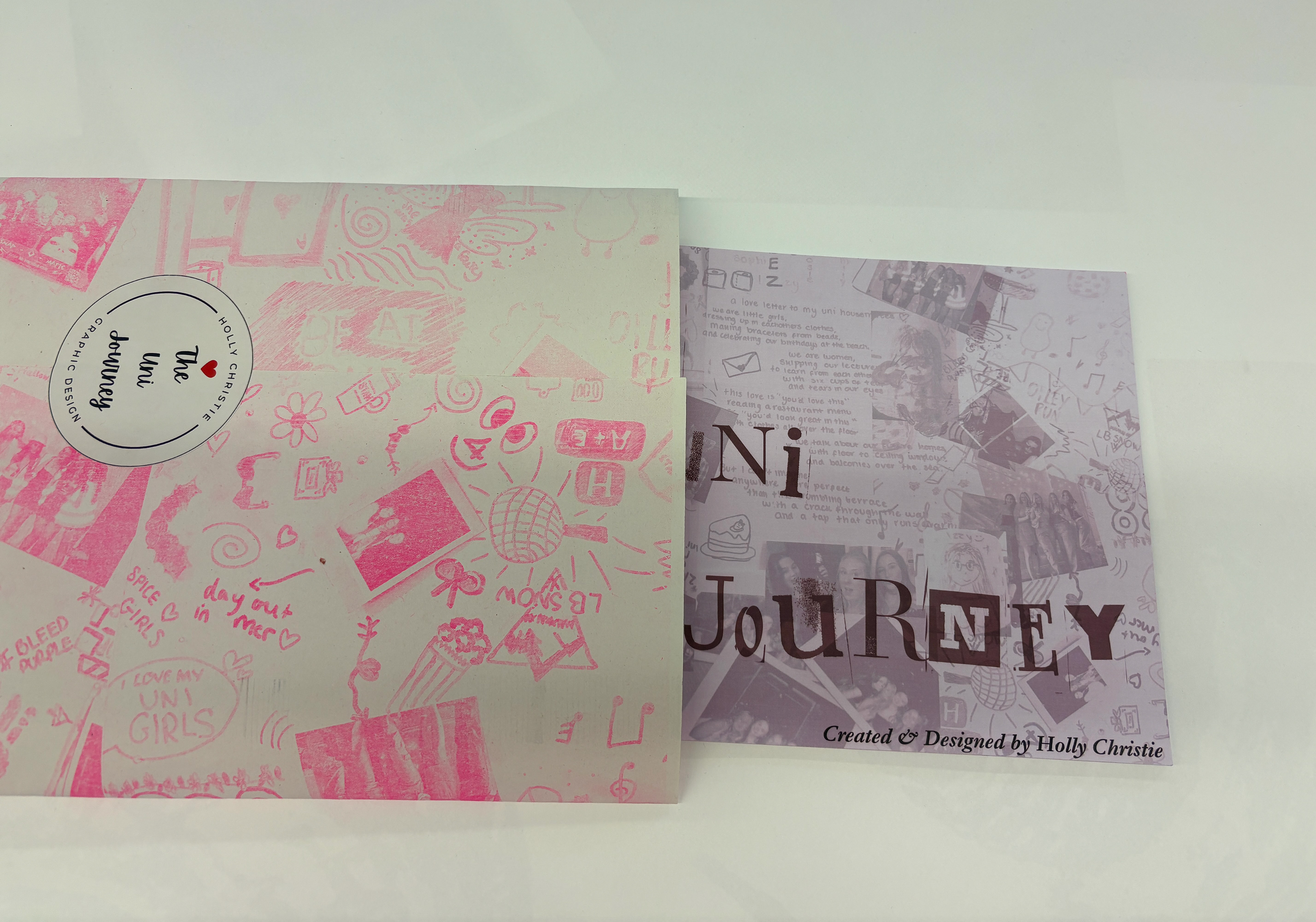
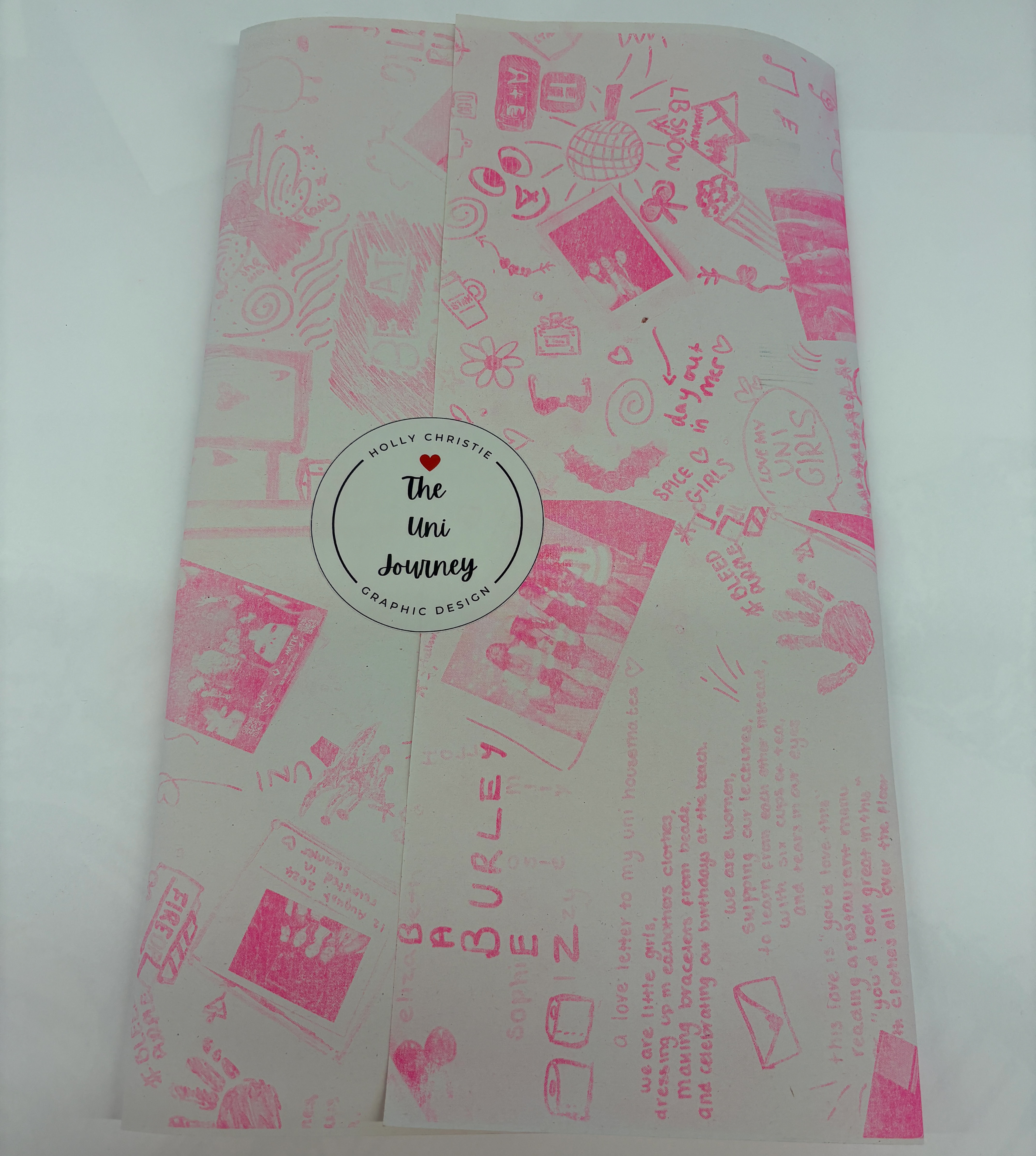
This is a wraparound cover slip I created for my uni journey book, using my pink A2 Risograph print and a custom-designed sticker to hold it all together.
FRAGMENTS OF LEEDS -
'RED BOOK'


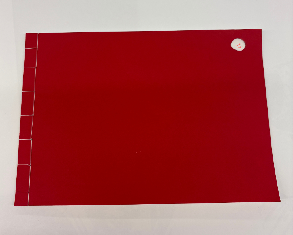
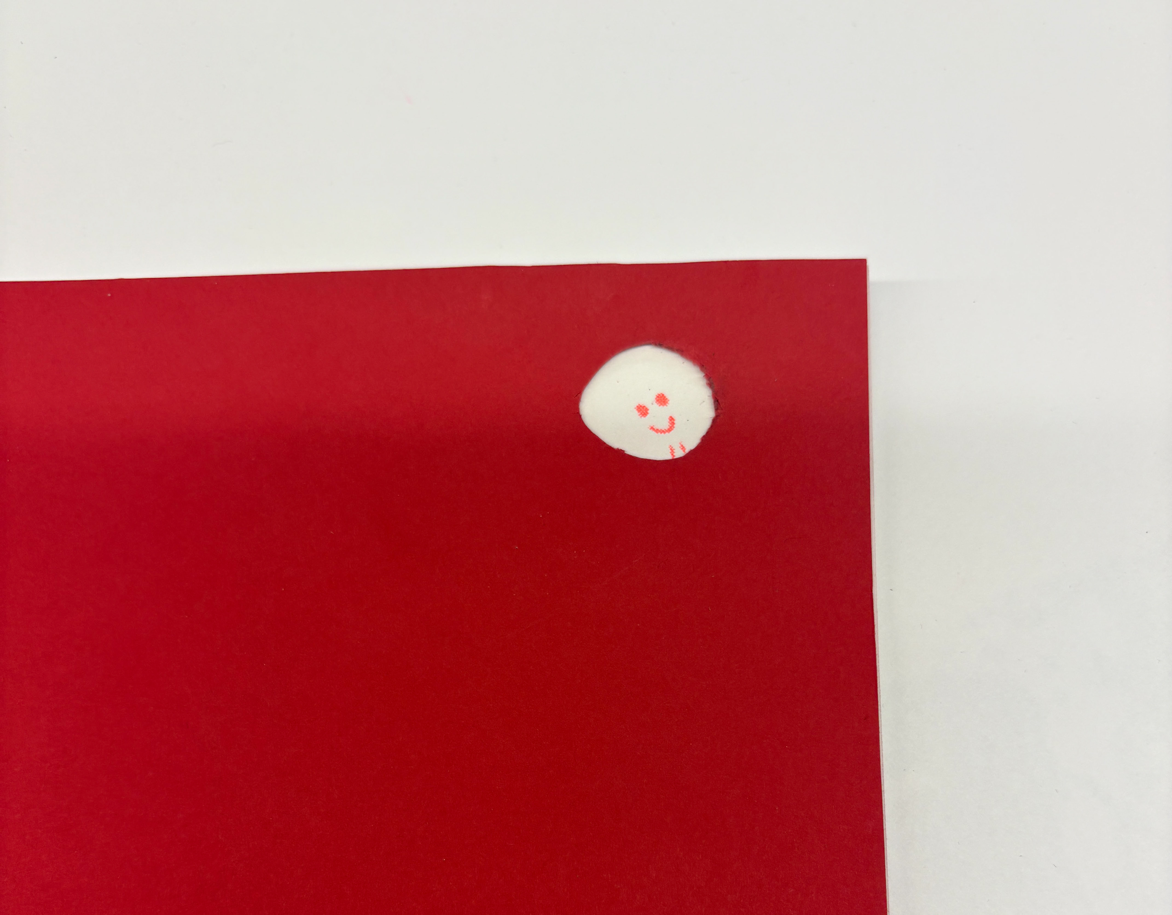
This book was more of an experimental piece, but I think it’s come together beautifully as a bold and eye-catching Riso-printed booklet. I bound it using a stab-stitch method, with striking red GF Smith card for the front and back covers. Inside, I used my Riso prints featuring Polaroid-style photographs of Leeds, overlaid with handwritten quotes taken from my student experience survey.
The book is A4 landscape and has a flip-book feel, simple in format but visually engaging. I also cut a small circular window into the front cover that reveals a hand-drawn smile underneath. It’s a playful detail that invites curiosity and encourages people to pick it up and explore what’s inside.
LIMITED EDITION PRINTS -
THE WHITEBOARD PROJECT
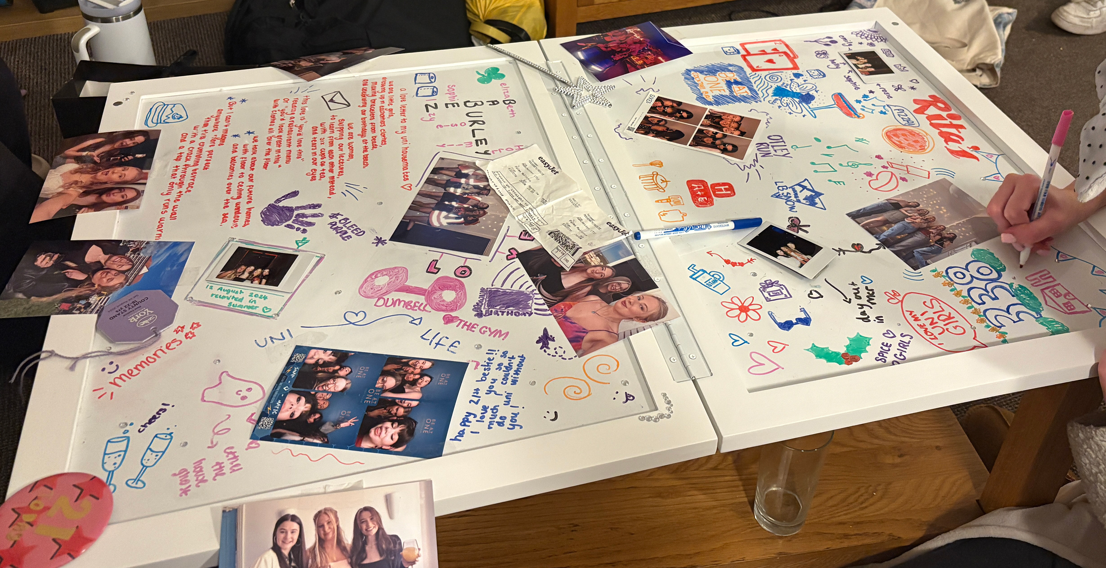


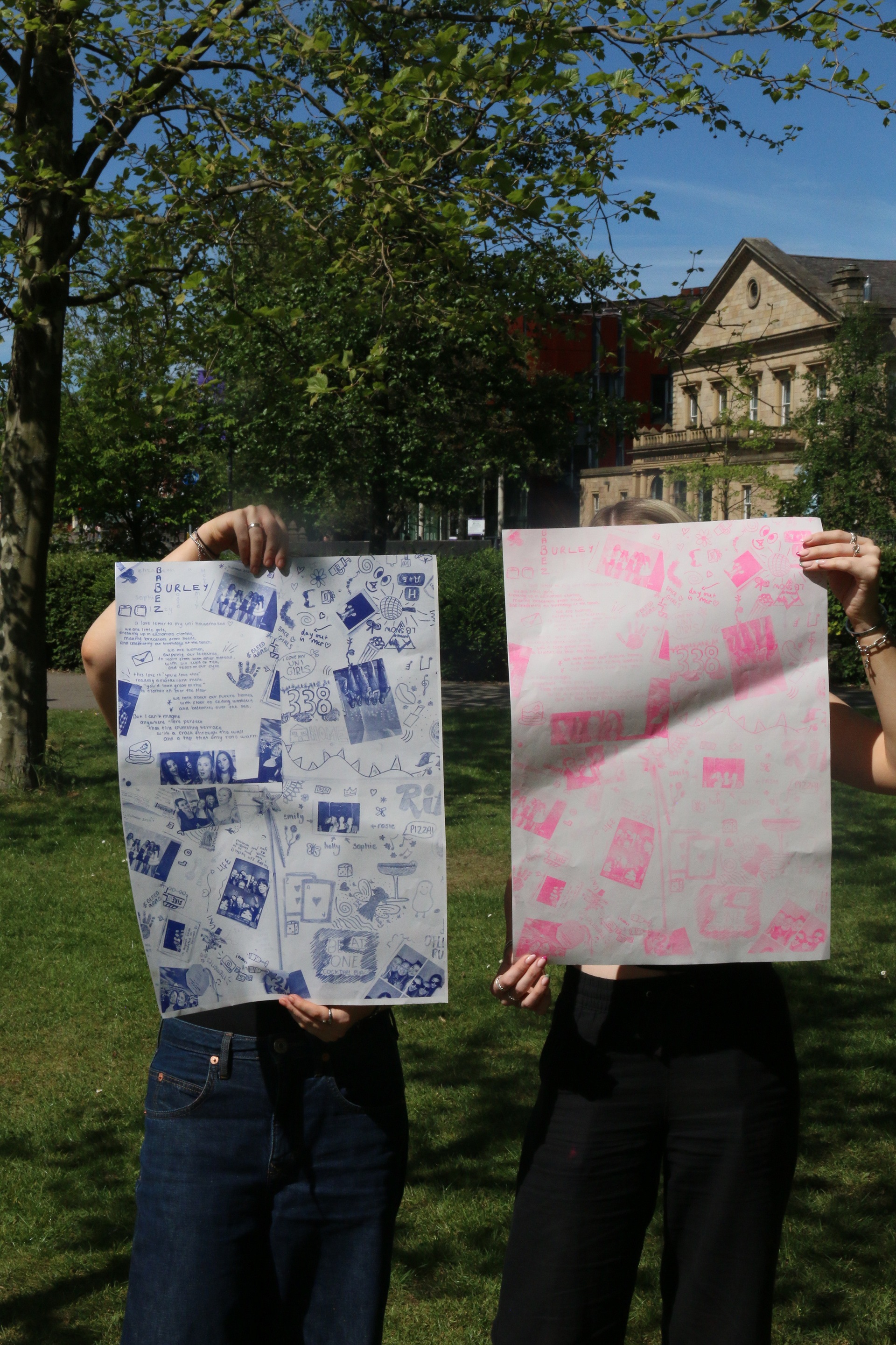
These limited edition Riso prints were developed from a collaborative experiment with my university housemates. I set up a large whiteboard in our shared space and encouraged everyone to contribute freely, writing, doodling, drawing, and adding personal photos. The result was a spontaneous, chaotic, and deeply personal visual collage that felt like a physical scrapbook of our shared experience.
I documented the board through photography, then carefully edited and translated these images into bold, colourful Riso prints. Each piece captures the energy and personality of that moment, celebrating imperfection, community, and creativity. With only a small number printed, these posters are designed to stand out—vibrant, expressive, and true to the playful, attention-grabbing style that runs through my work.


These posters build on the background textures of my original Riso prints, incorporating real student quotes from my survey to reflect the emotional highs and lows of university life. Using a digital handwritten typeface, I layered both positive and negative messages to present an honest, balanced portrayal of the student experience.
I’ve labelled this series as Student Wellbeing Posters, intended to be displayed in spaces like the university’s wellbeing centre or student union. The goal was to move away from the often plain, clinical feel of typical mental health signage and instead create something visually engaging, colourful, relatable, and approachable. These posters aim to reassure students that they’re not alone, while drawing attention through bold design and personal storytelling.
A2 RISO -
NEWSPAPER-STYLE PRINTS


These A2-sized versions of my Riso prints were created to explore how the designs would translate at a larger scale. They work effectively as bold, eye-catching posters that act as visual memory pieces, capturing the essence of the university experience through personal moments, textures, and colour.
The idea is that each print could serve as a ‘memory poster’, something students could create from their own experiences as a positive reminder of their time at uni. For me, this piece represents a snapshot of the good moments, designed to lift your mood and evoke a sense of nostalgia when you need it most.
Visually, the backgrounds have proven versatile, they could work as poster art, zine layouts, or even as a vibrant newspaper cover. One of the large-scale prints is being used as a wraparound cover for my university journey book, adding a striking and visually engaging layer that helps tie the whole collection together.
REAL TALK WELCOME PACK –
SUPPORT FOR NEW STUDENTS


This pack was designed as a practical and thoughtful resource for new university students—something I felt was genuinely missing from my own experience. I wanted my final project to do more than just explore ideas; I wanted it to offer a real solution to a real problem.
Starting university can be overwhelming, especially when you're moving to a completely new city and don’t know where anything is or who to turn to. Often, students are left to figure things out on their own. The Real Talk Welcome Pack is my response to that gap: a friendly, engaging, and reassuring introduction to student life, created by students, for students.
The branding, Real Talk, reflects the heart of the concept—honest advice, guidance, and insight directly from students who’ve been through it. The pack includes:
- A Real Talk student guide magazine full of useful info and real experiences
- A custom-designed notebook
- A set of postcards (some with uplifting messages from other students, others blank for students to use and share their thoughts)
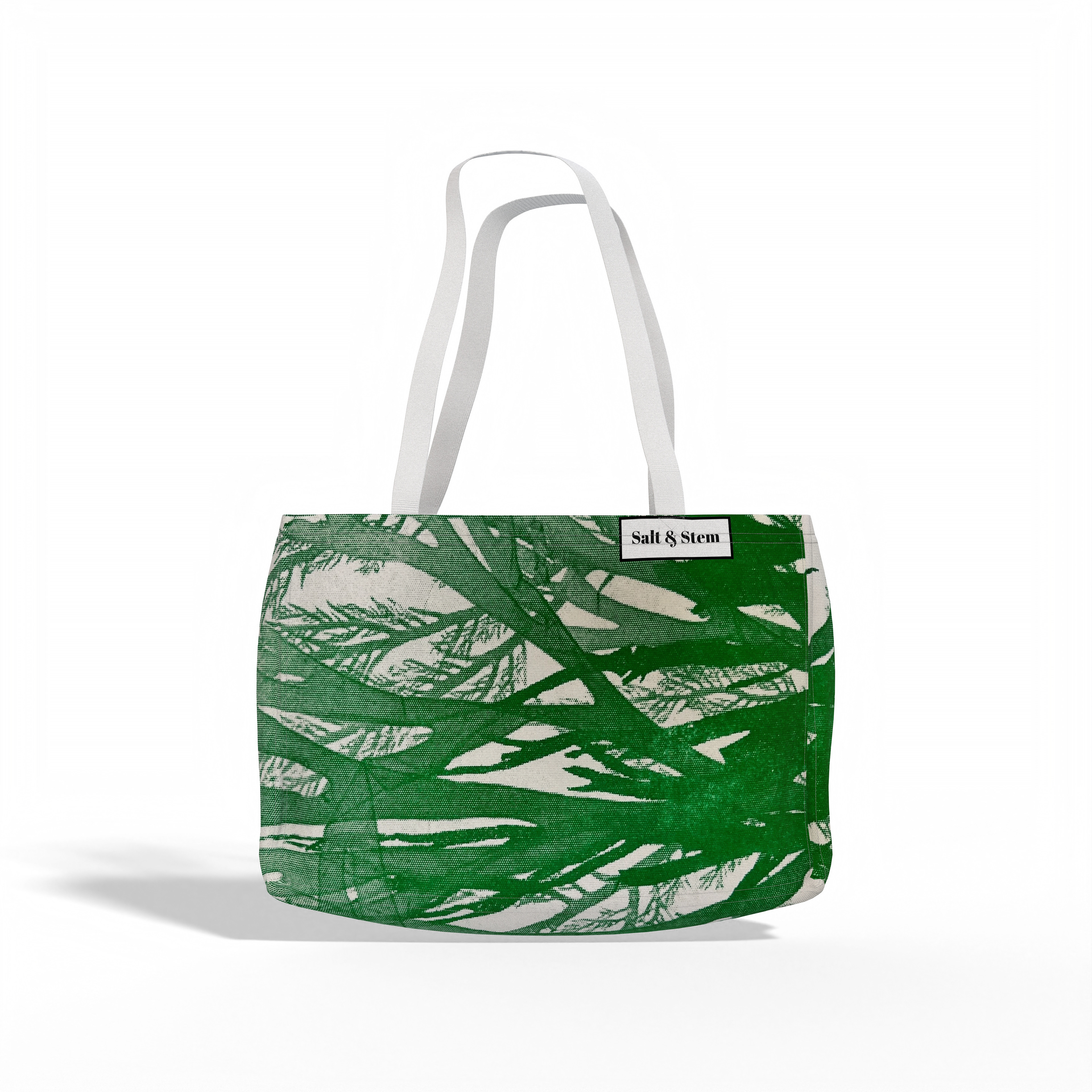
- A stylish tote bag designed to be both functional and expressive
Altogether, this pack aims to help new students feel more connected, informed, and supported from the moment they arrive.
POSITIVE POSTCARDS


'SHARE YOUR THOUGHTS' -
CUSTOM STAMP DESIGN & KEYRINGS
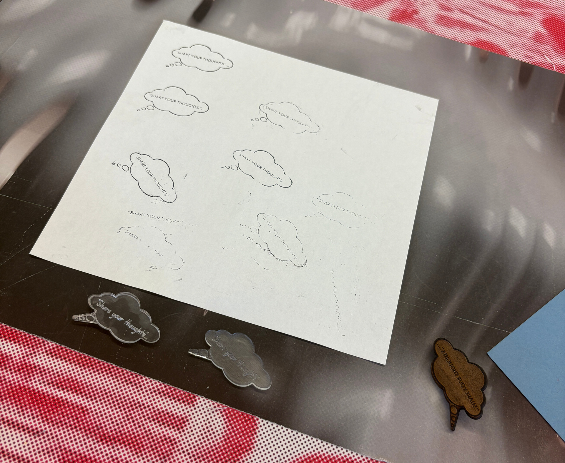
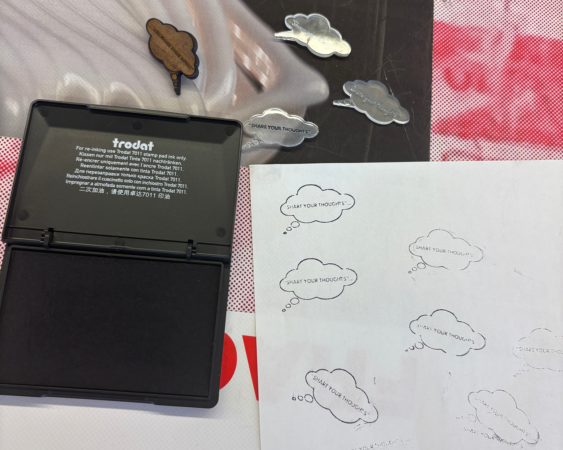
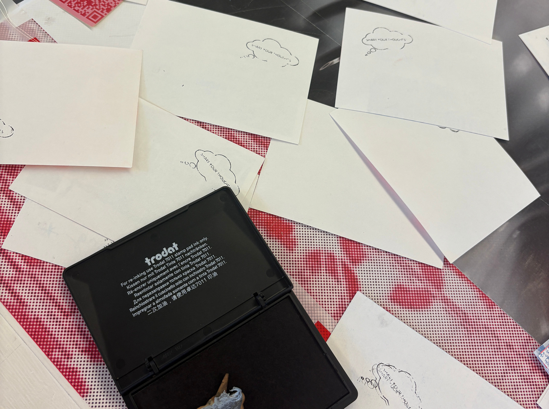


As part of the Real Talk pack, I designed a custom stamp to be used on the blank postcards included in the set. The aim was to encourage students to write down their thoughts, reflect on their university journey, and track their personal growth over time. Whether used for self-reflection, emotional release, or simply to capture a moment, these postcards offer a small but meaningful space for students to pause and check in with themselves.
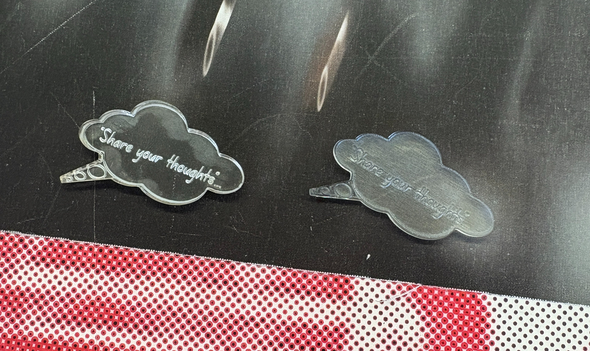
I created a thought bubble design featuring a short prompt inside, then laser-cut the stamp in the printmaking workshop using leftover materials. The first version was cut from acrylic, but the ink didn’t adhere well to the surface, resulting in inconsistent prints. I then switched to wood, which gave a much more effective and tactile print finish, adding a handmade, personal feel to each card.
This small detail gives the postcards a distinctive touch and ties into the overall ethos of Real Talk, honest, supportive communication, in a format that feels approachable and creatively designed.
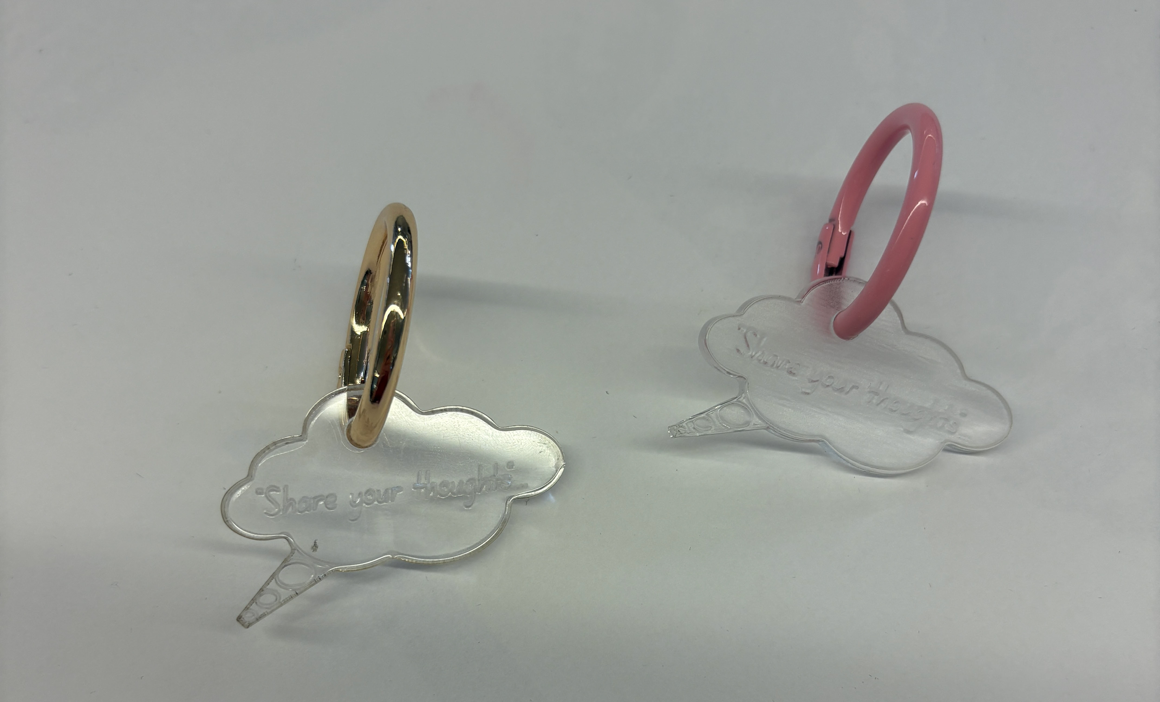
I also decided to repurpose the unused acrylic stamps by turning them into keyrings, giving them a new life and showing an alternative way they could function as a design element rather than letting them go to waste. Additionally, I tipped in the blank set of postcards alongside the stamp, allowing them to be easily removed while still keeping everything neatly together, offering a creative and distinctive approach to packaging the set as a cohesive pack.
REAL TALK STUDENT MAGAZINE


REAL TALK NOTEBOOK


REAL TALK IN ACTION
- PROMOTIONAL PHOTOGRAPHY SERIES
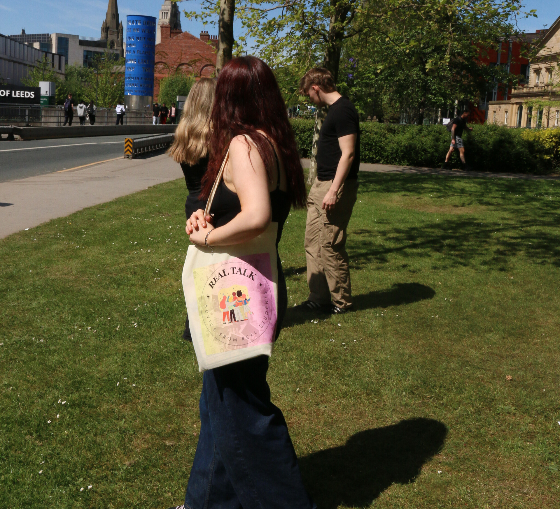


This series of photographs was taken on location near campus to bring the Real Talk brand to life in a real student environment. I asked a few friends and fellow students to model with the full pack—including the magazine, notebook, postcards, and tote bag, as well as hold up my wellbeing posters and selected prints.
The aim was to visually communicate how these pieces would exist in everyday student life, while also adding bold, engaging context to the overall project. This shoot not only reinforces the message of Real Talk but also allowed me to incorporate and showcase my photography skills as part of the creative process.
‘HELLO’ PROJECT –
SELF-PROMOTIONAL DESIGNER CARD PACK


As part of the Hello project, we were asked to create a self-promotional piece that reflects our unique identity and design interests. I developed a bright, colourful card pack, held together on a ring, that showcases my personality, style, and the range of work I've produced during my time at university.
Each card features a different design, representing a specific area or theme I’ve explored, with a short explanation on the back outlining why that type of design interests me. I also created a personal logo, which appears on every card to visually tie the pack together and strengthen my personal brand. The final card includes my contact information and a link to my online portfolio.
This piece is designed to be eye-catching, playful, and informative, much like my overall approach to design, while offering a tactile and engaging way for people to get to know me and my work.
THE ORIGINAL CHELSEA GIRL –
NORTHERN FILM SCHOOL COLLABORATION


This project was part of a live collaboration with film students from the Northern Film School, based on their documentary The Original Chelsea Girl. The film follows a group of students who travel to New York to rediscover the life and work of Sandy Daley, a once-prominent artist tied to the Chelsea Hotel scene in the 1960s and ’70s.
Inspired by the film’s themes of memory, art, and rediscovery, I designed six poster variations and two business card designs for the film team, The Dakota Collective. These pieces were created to support the documentary’s promotion and provide the group with professional branding they could continue to use beyond university.
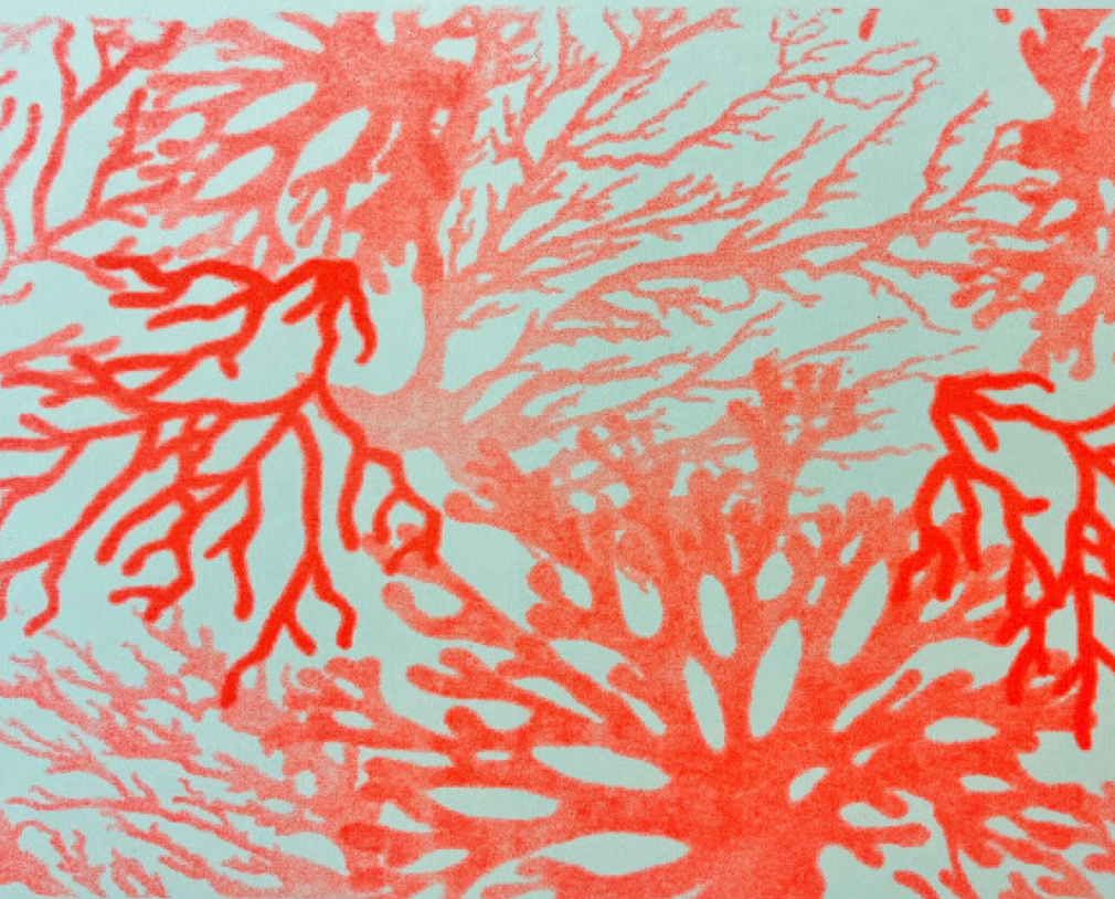
THE LIFE OF PLANTS – ZINE DESIGN


This zine was created in response to The Life of Plants brief—an optional final-year project that invited us to explore and communicate a plant’s story, whether through its ecological role, healing properties, or joyful presence. The challenge was to present this in a sequential format such as a book, animation, or print series, ideally from the plant’s own perspective.
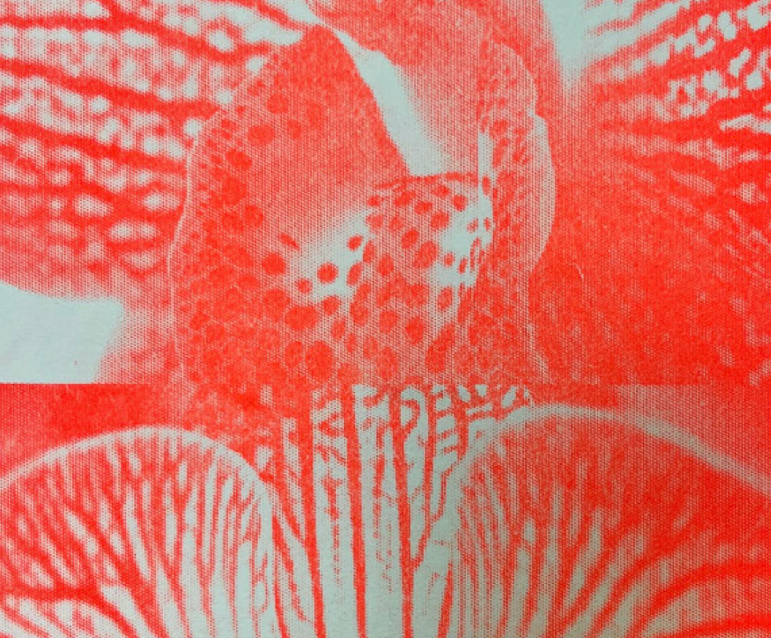
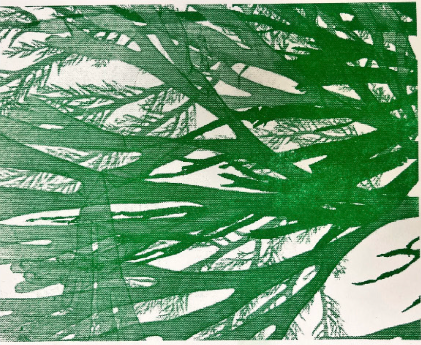
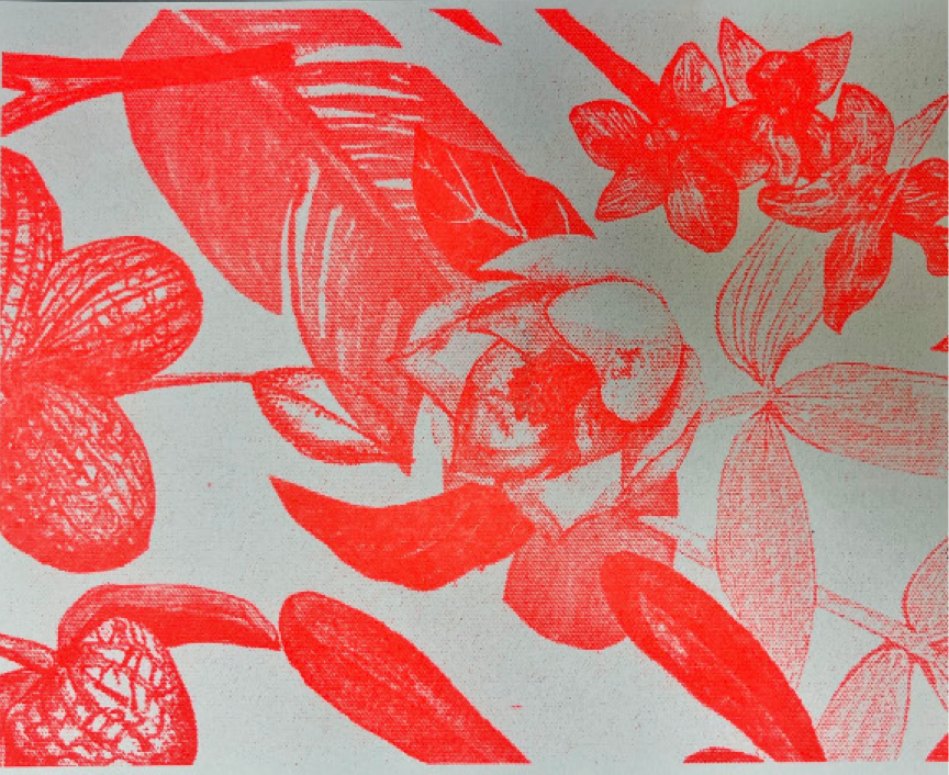
I chose to focus on seaweed and orchids, building on the sustainability research and visual work I had previously explored in my self-initiated project. This brief gave me the opportunity to extend that work and bring a new narrative layer to it.
Using a selection of my Risograph prints, I designed and produced a zine that shares facts, stories, and imagined “voices” of the plants to highlight their importance within ecosystems, and the urgent need to protect them. The zine celebrates their unique qualities in an engaging and design-led way, using vibrant visuals and accessible language to inform and inspire.
To add an interactive and educational element, I included a QR code on the final page linking to information on how seaweed extract can support orchid growth, reinforcing the connection between the two species and encouraging further exploration.
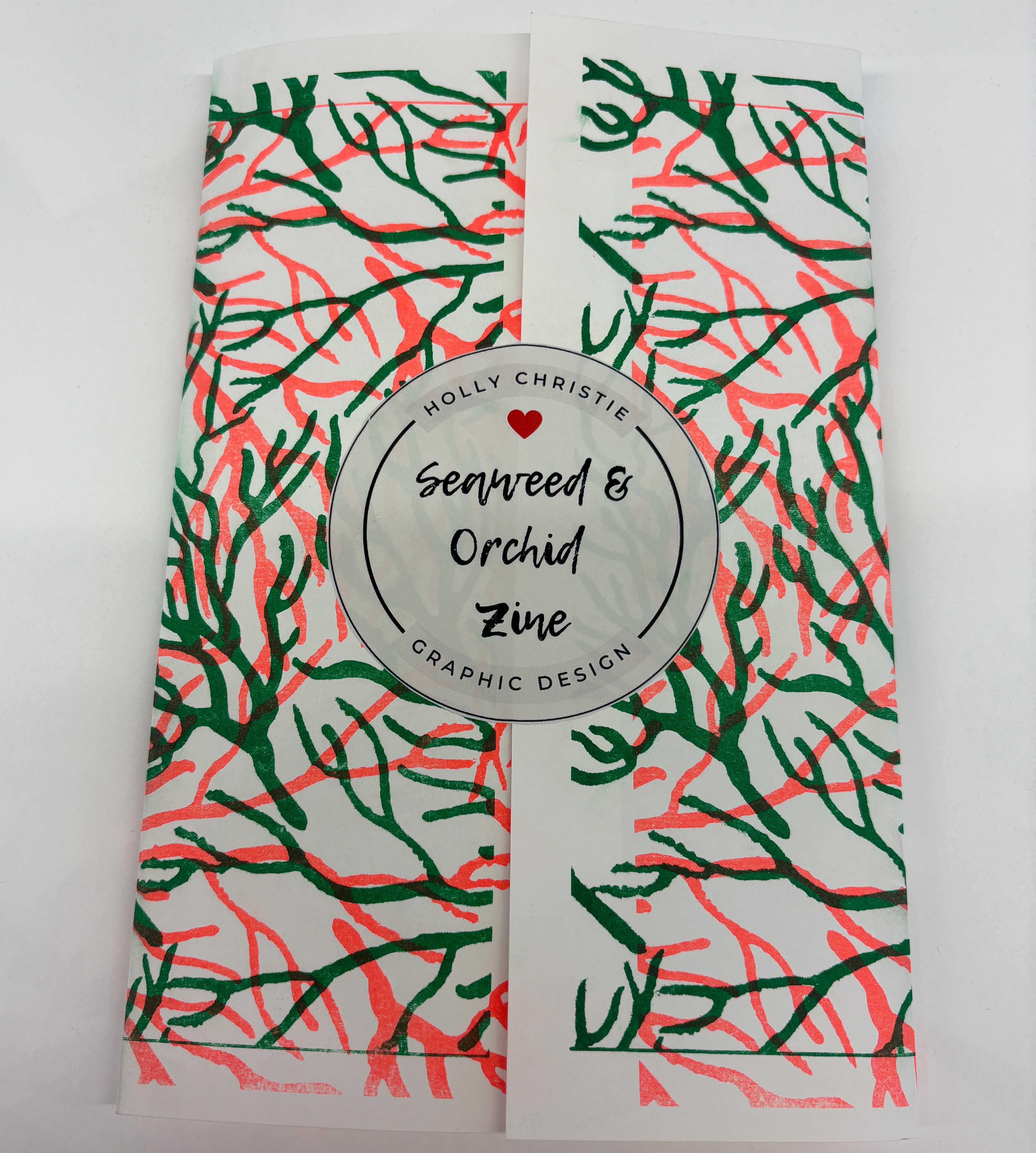
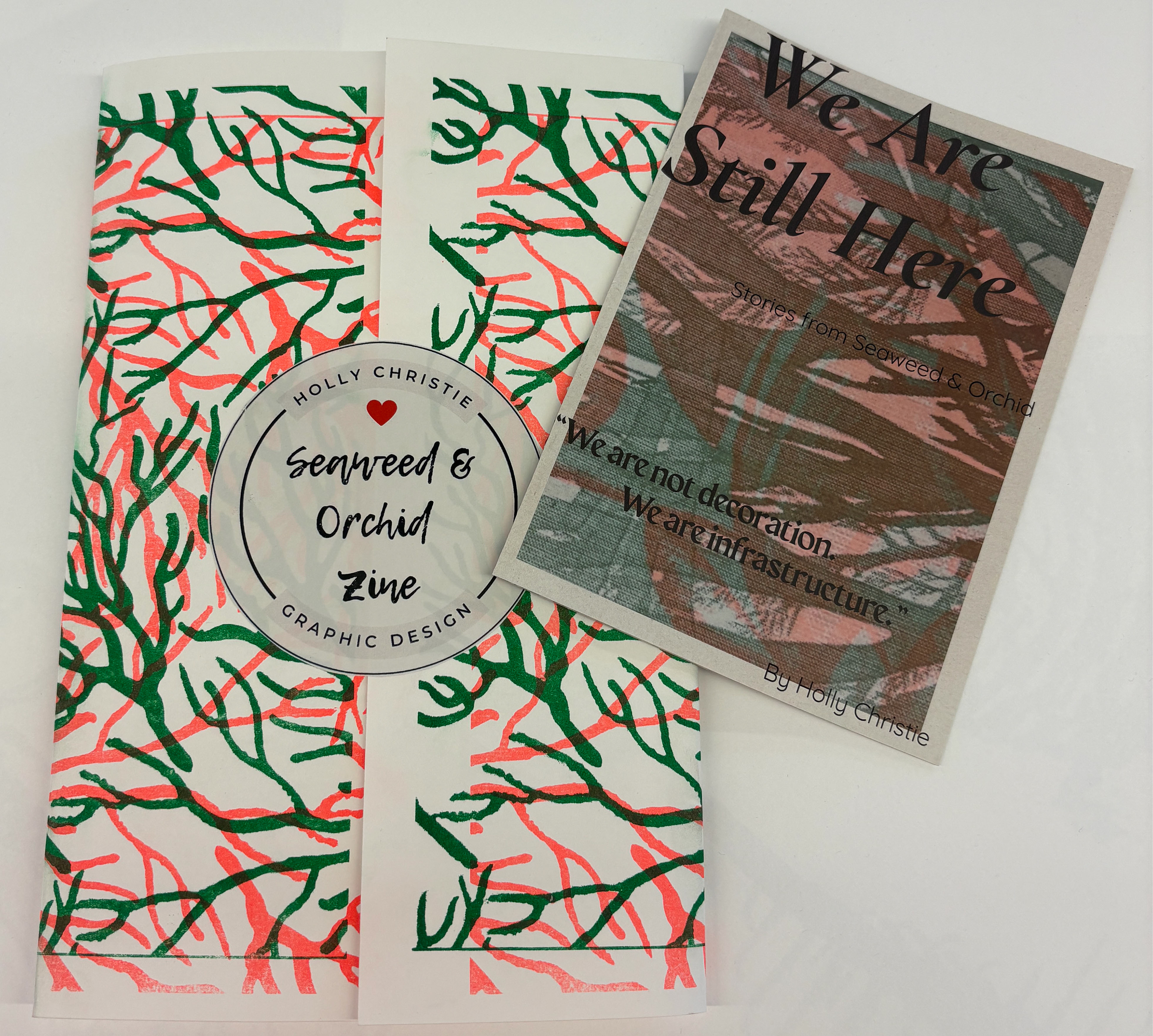
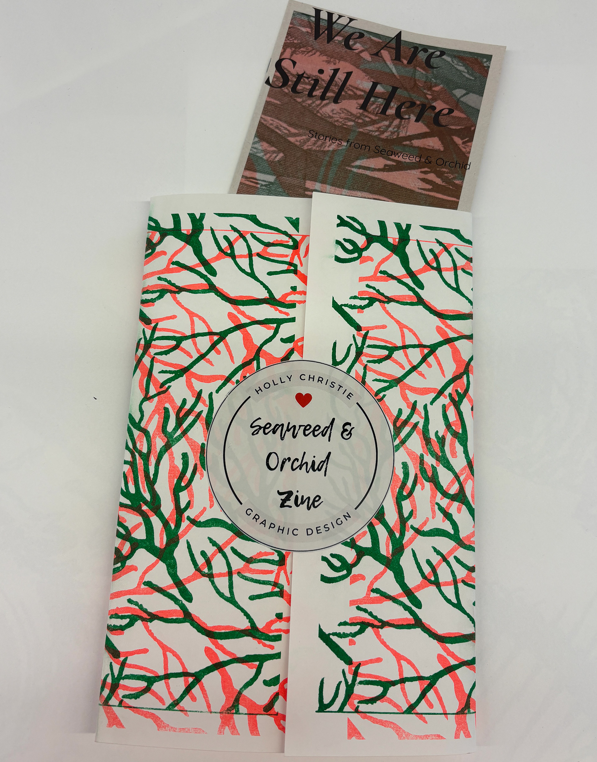
This is a wrap-around cover slip I created to hold my zine together, using one of my risograph prints from a previous project exploring the importance of seaweed and orchids. I sealed it with a custom sticker I designed.
SALT & STEM -
BOTANICAL BRAND CONCEPT

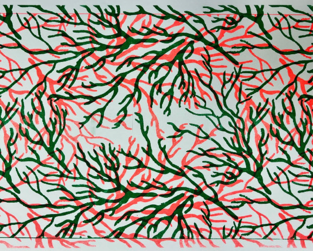
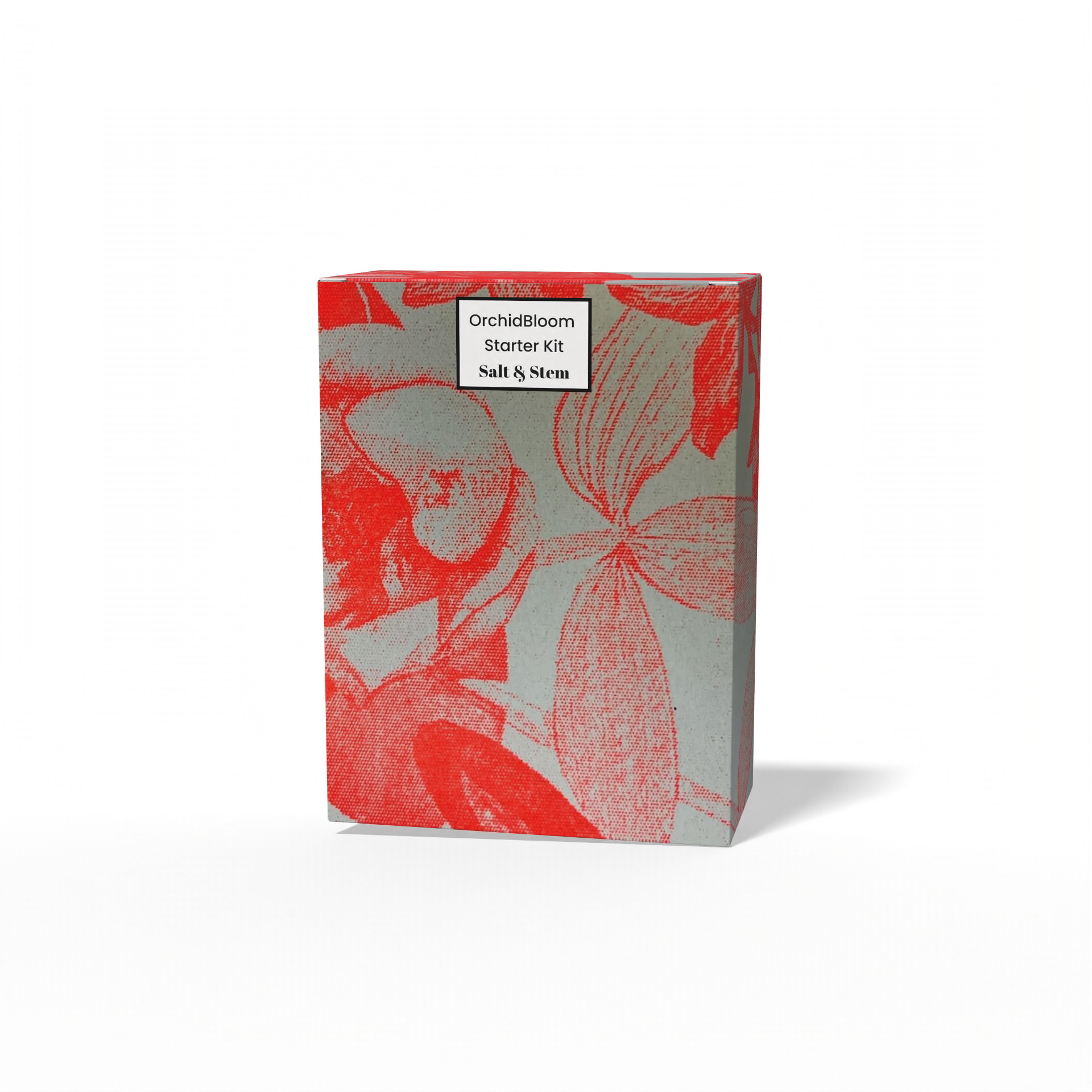
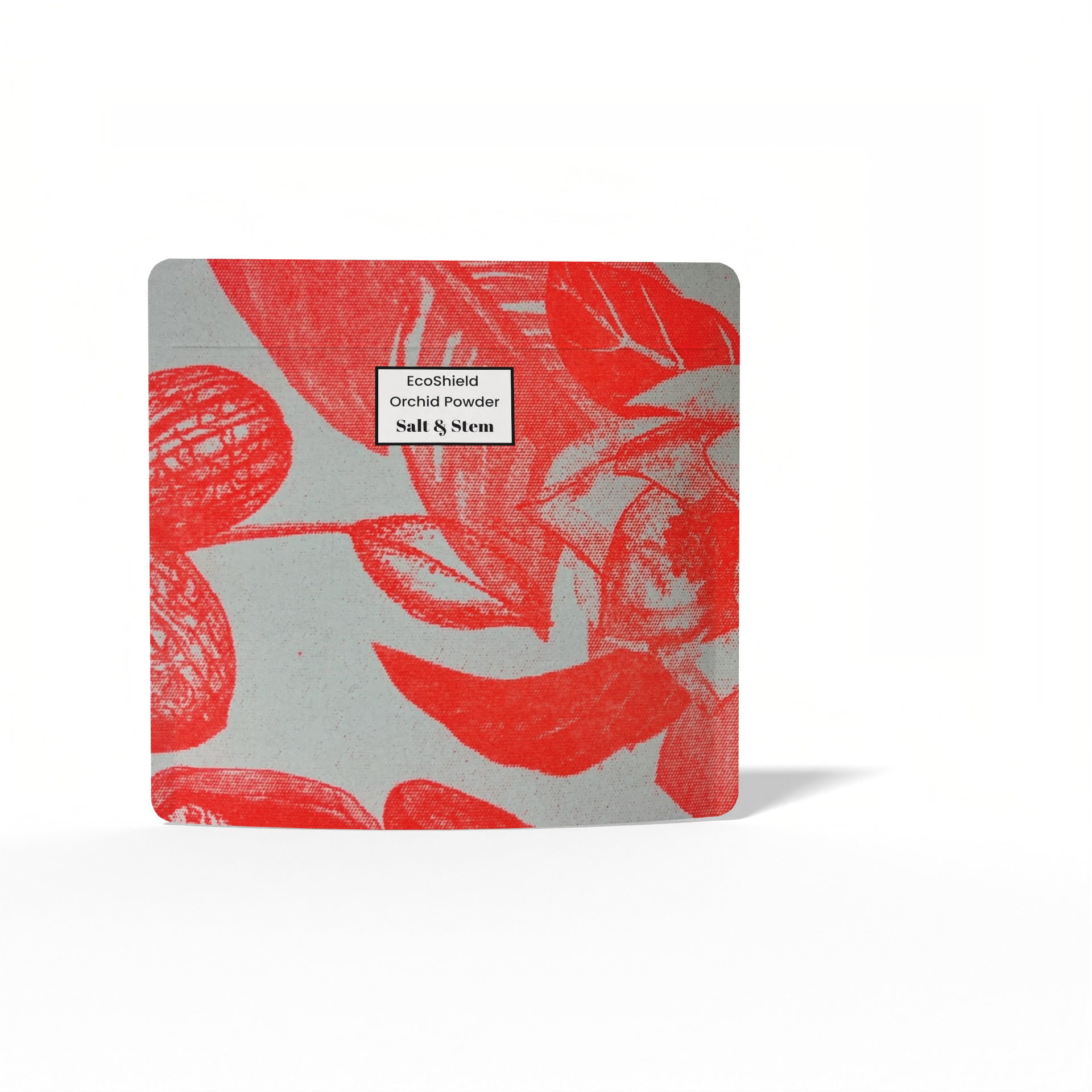


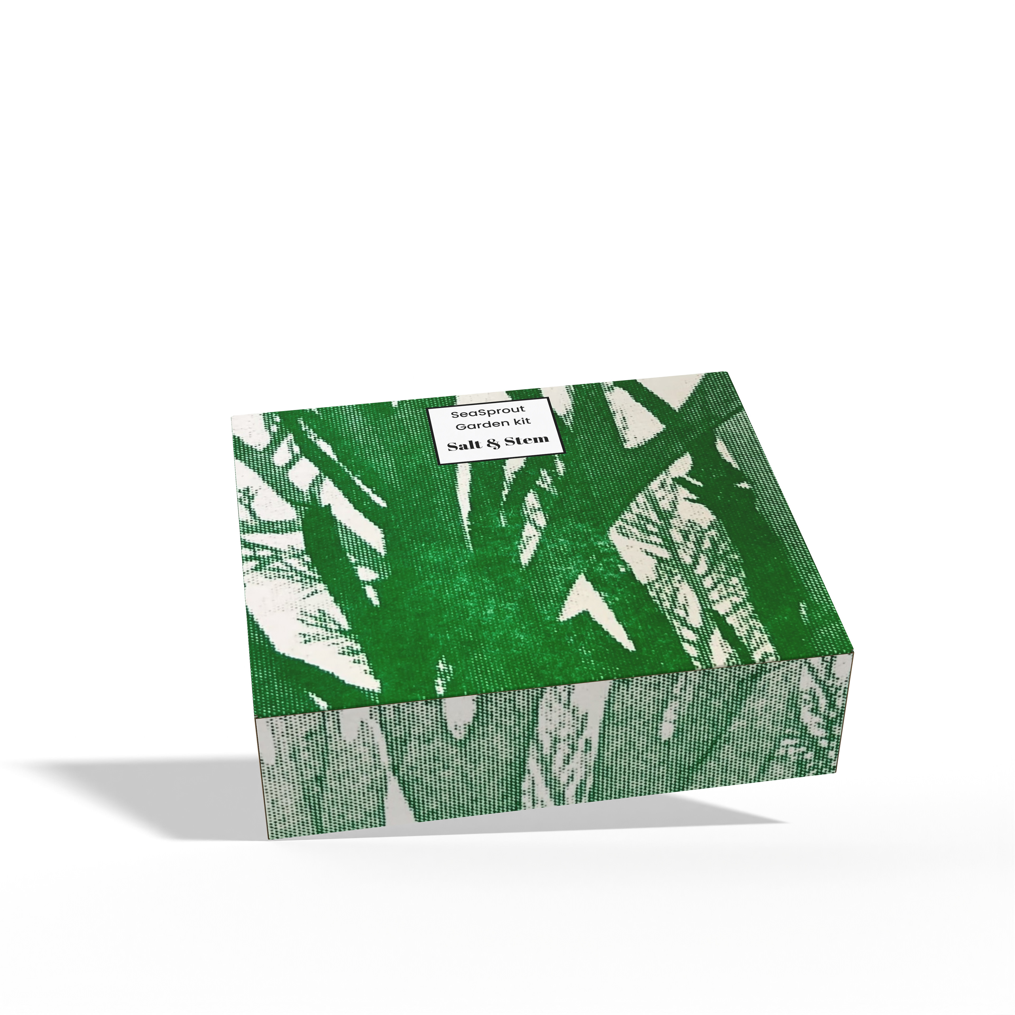


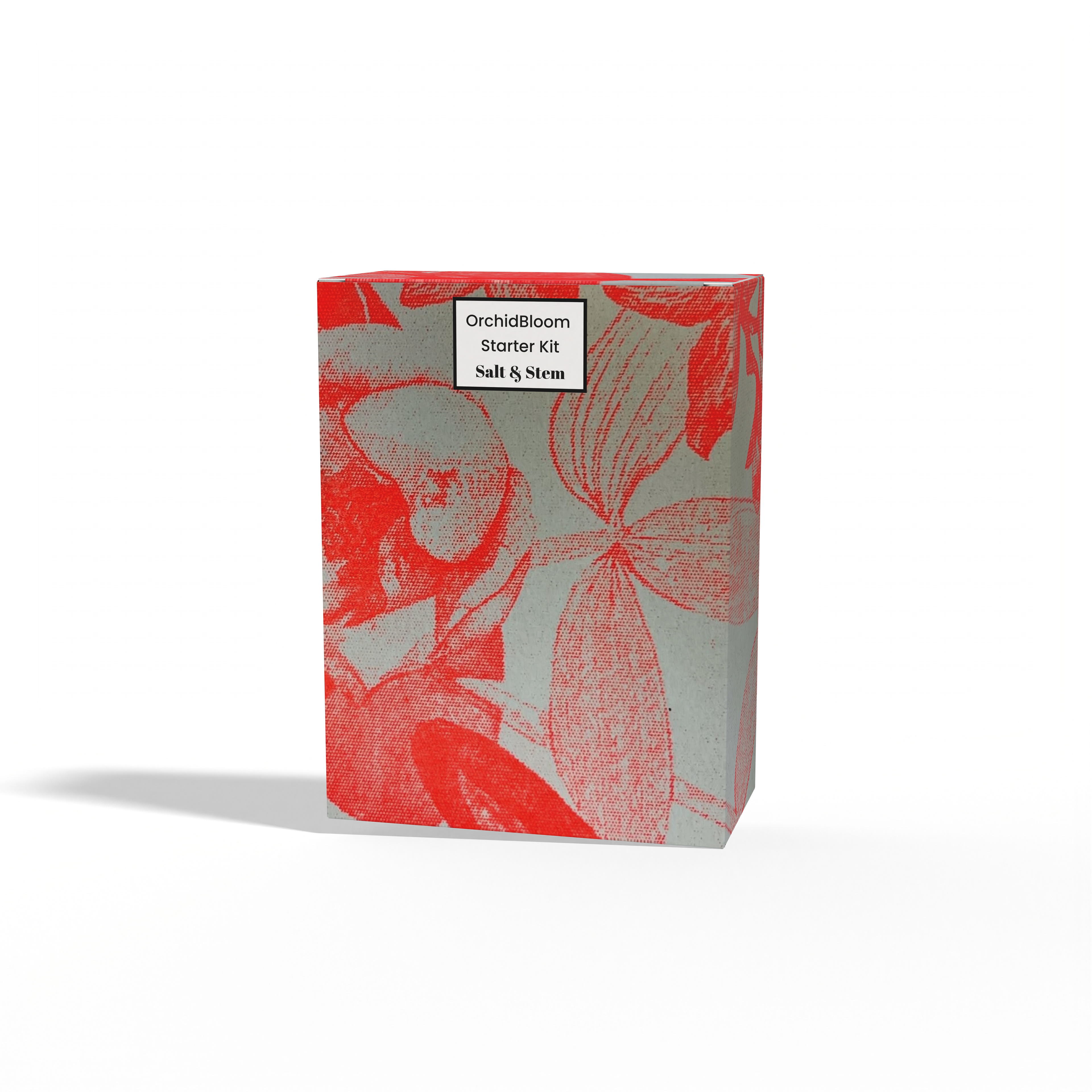
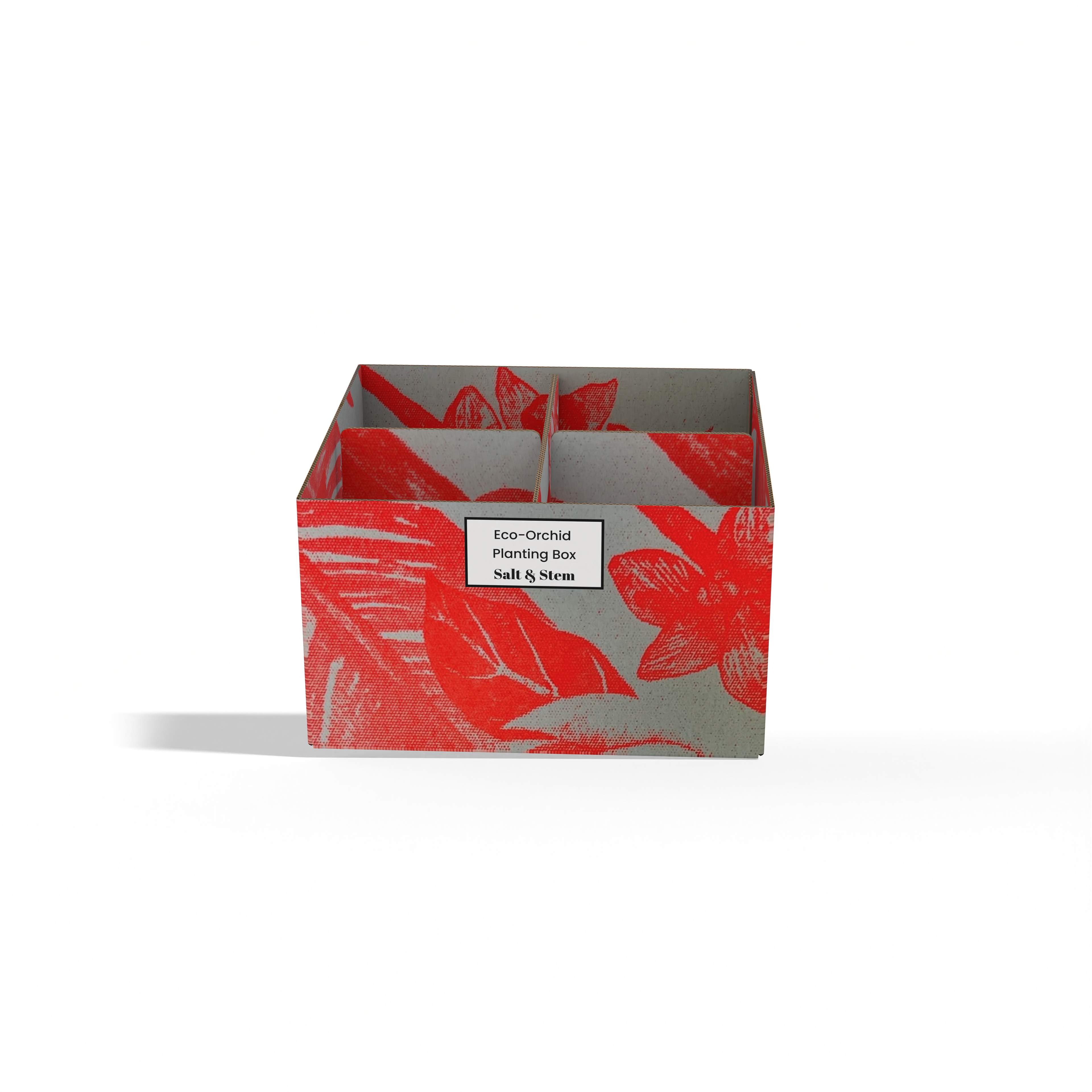
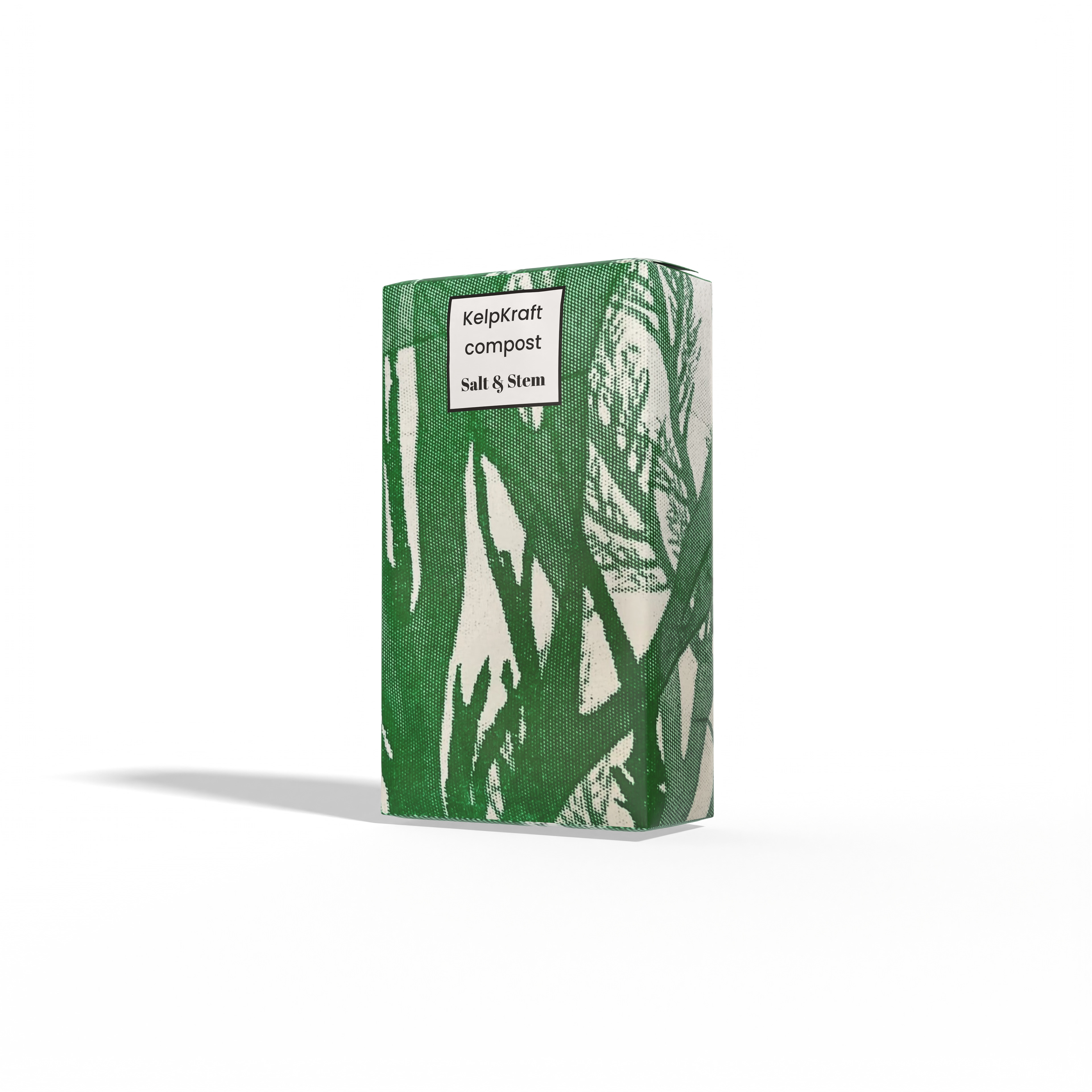
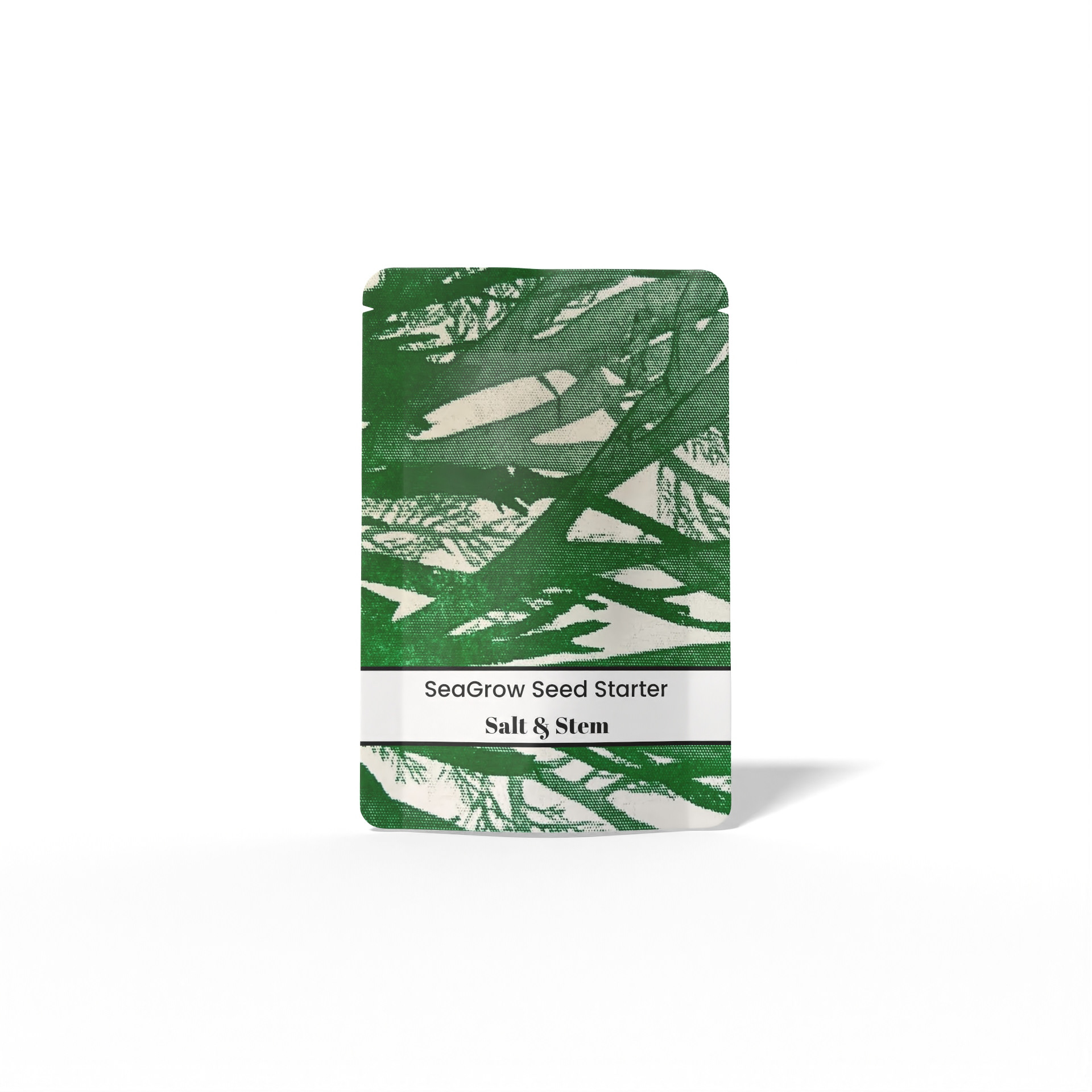


Salt and Stem is a conceptual gardening brand focused on the conservation and growth of seaweed and orchids. Inspired by the natural beauty and importance of these species, the brand promotes education, sustainability, and environmental awareness through bold, engaging design.
I created a series of vibrant Risograph prints using photographs of seaweed and orchids, which became the visual foundation for the brand. These designs were then applied across packaging for gardening products that support the care and propagation of these plants.
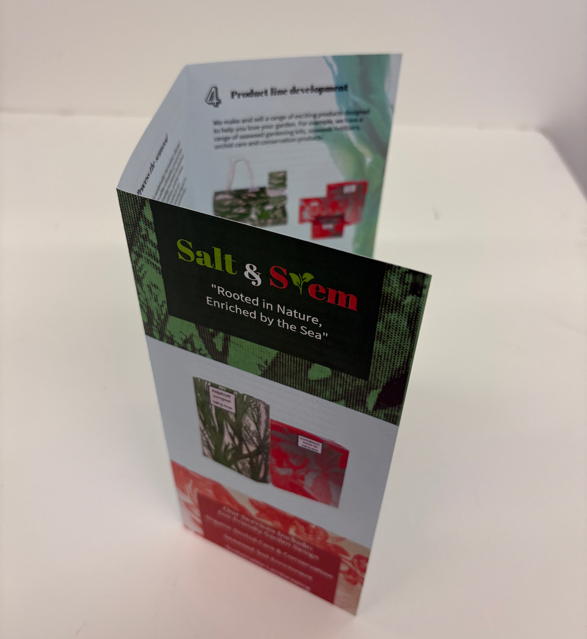
The name Salt and Stem reflects the brand's dual focus—“Salt” symbolizing the ocean and seaweed, in soft green hues, and “Stem” representing orchids, with a warm pink-red tone. The logo includes a stylized leaf replacing the "T" in "Stem" to subtly reinforce the brand’s organic identity. The slogan, “Rooted in nature, enriched by the sea,” captures the connection between land and ocean ecosystems, central to the brand’s mission.
SALT AND STEM LEAFLET –
BRAND STORY & PROCESS
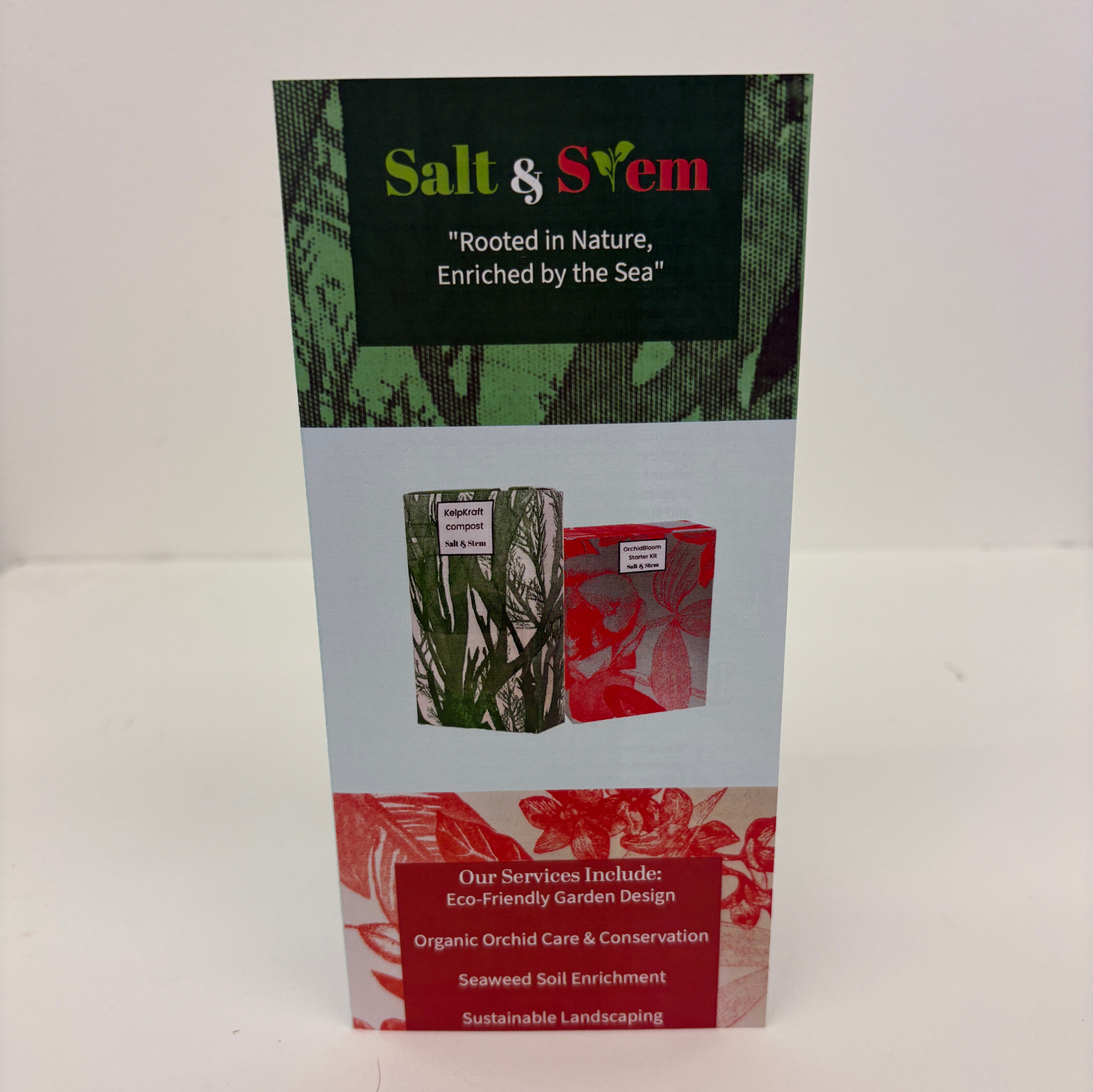
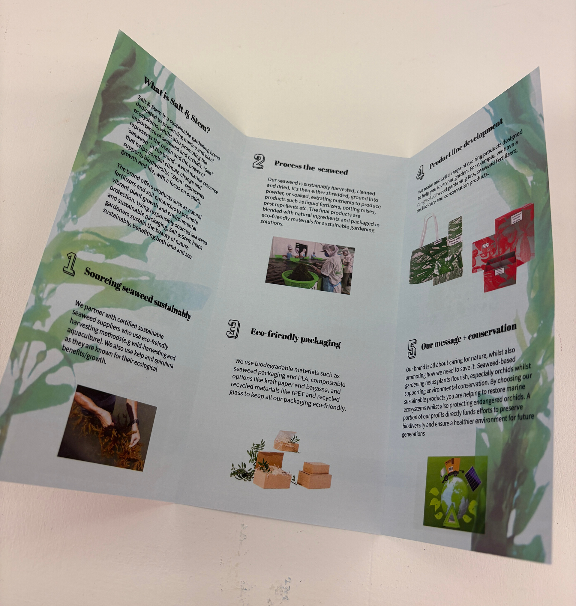


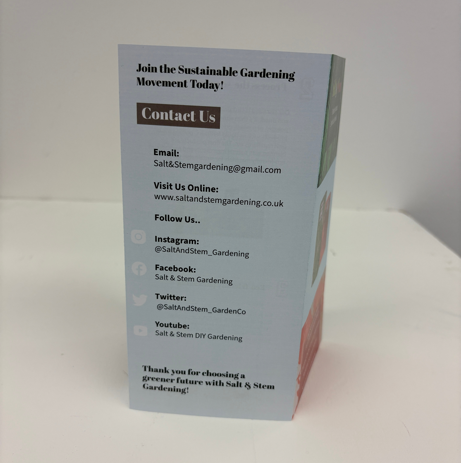
To accompany the brand launch, I designed a printed leaflet using recycled paper to align with Salt and Stem’s commitment to sustainability. This leaflet is both informative and visually engaging, created to clearly communicate the brand’s values, purpose, and product development process.
The leaflet features a step-by-step breakdown of how each product is made, from sourcing materials to final packaging, emphasising the environmental benefits of supporting seaweed and orchid conservation. Throughout the layout, I incorporated background imagery of the plants, as well as visuals representing each production step.
The front cover uses patterns derived from the packaging designs, reinforcing the brand’s artistic identity. Product photographs are also included to showcase the final outcomes, highlighting both their functionality and aesthetic appeal. Overall, the leaflet reflects Salt and Stem’s mission to deliver nature-saving, sustainable solutions in a way that’s both meaningful and beautifully designed.
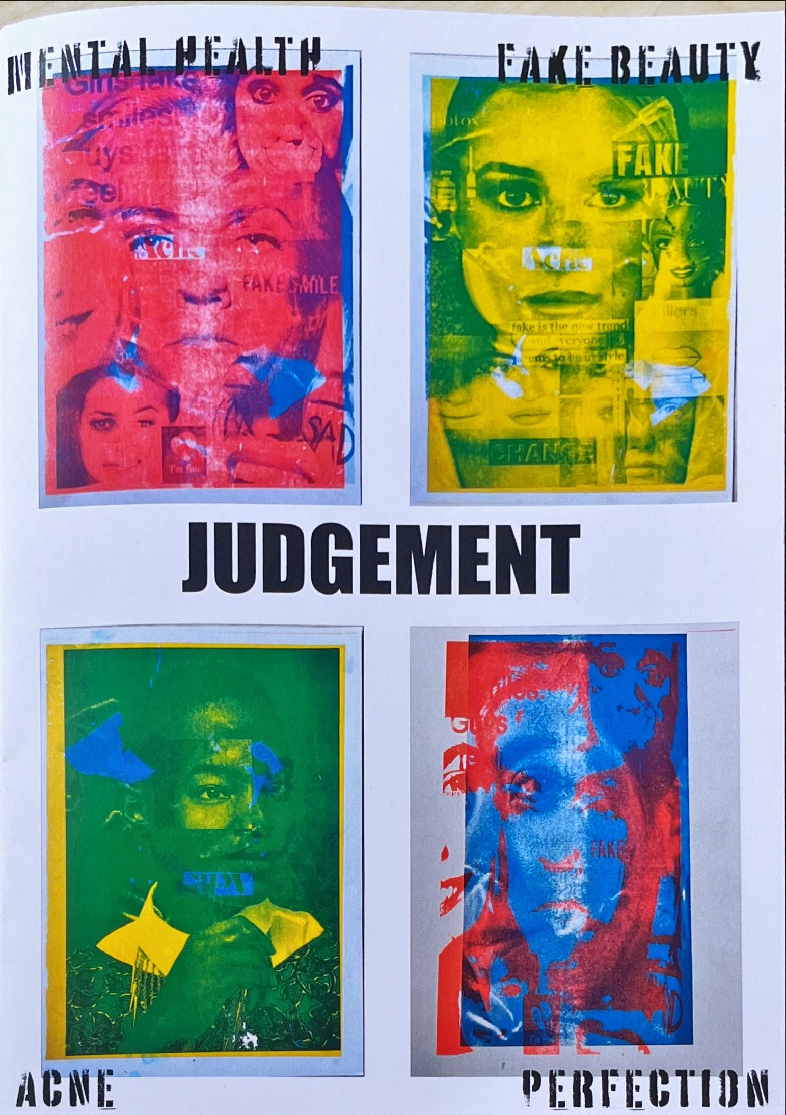
JUDGED -
RISOGRAPH POSTER SERIES ON YOUTH IDENTITY
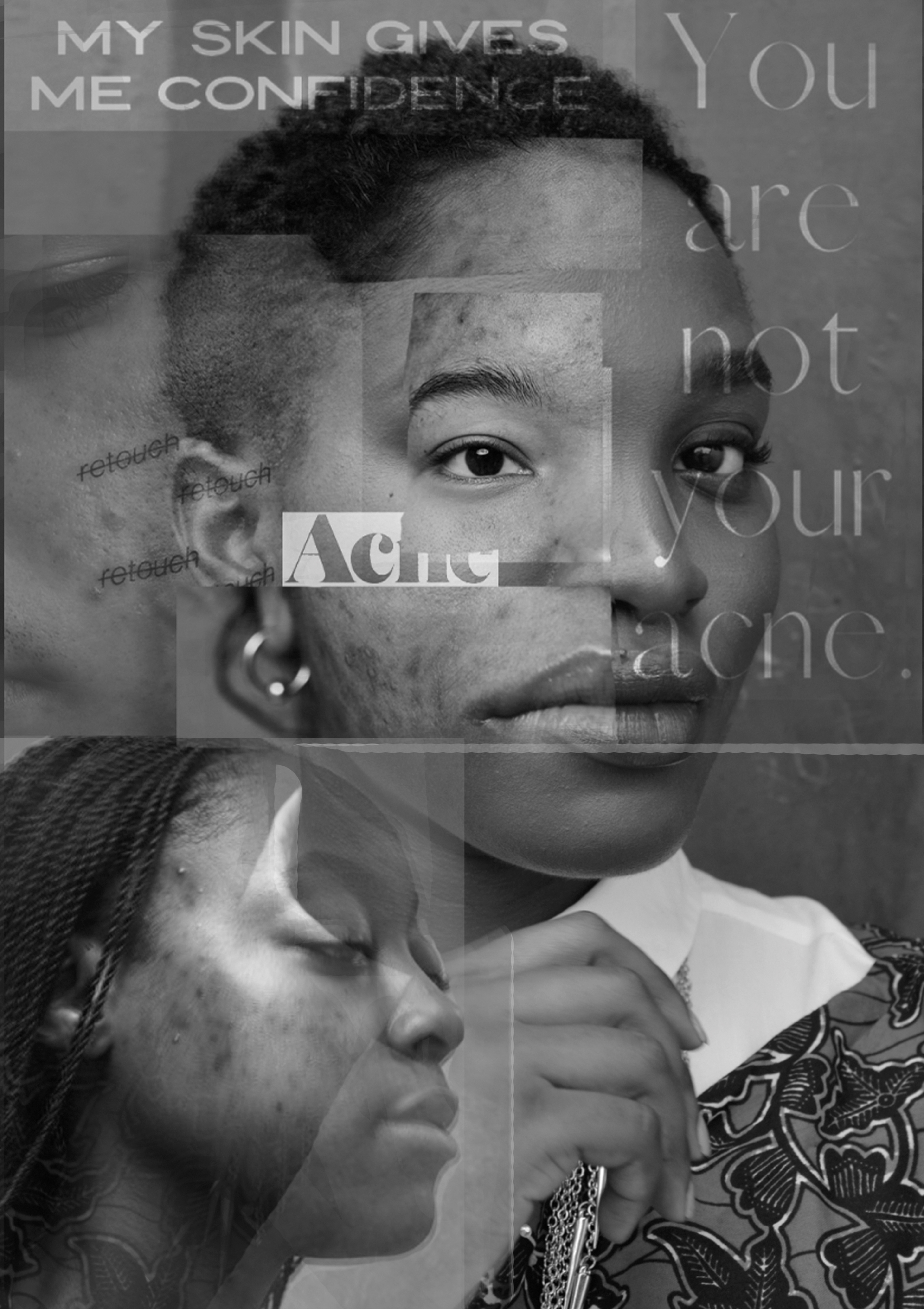
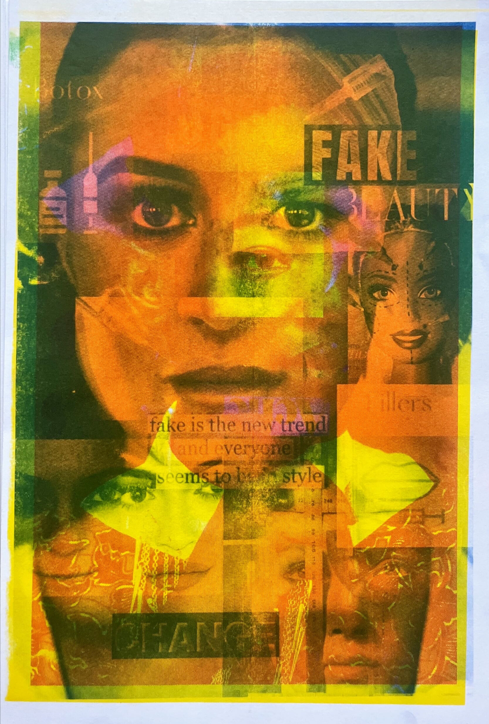
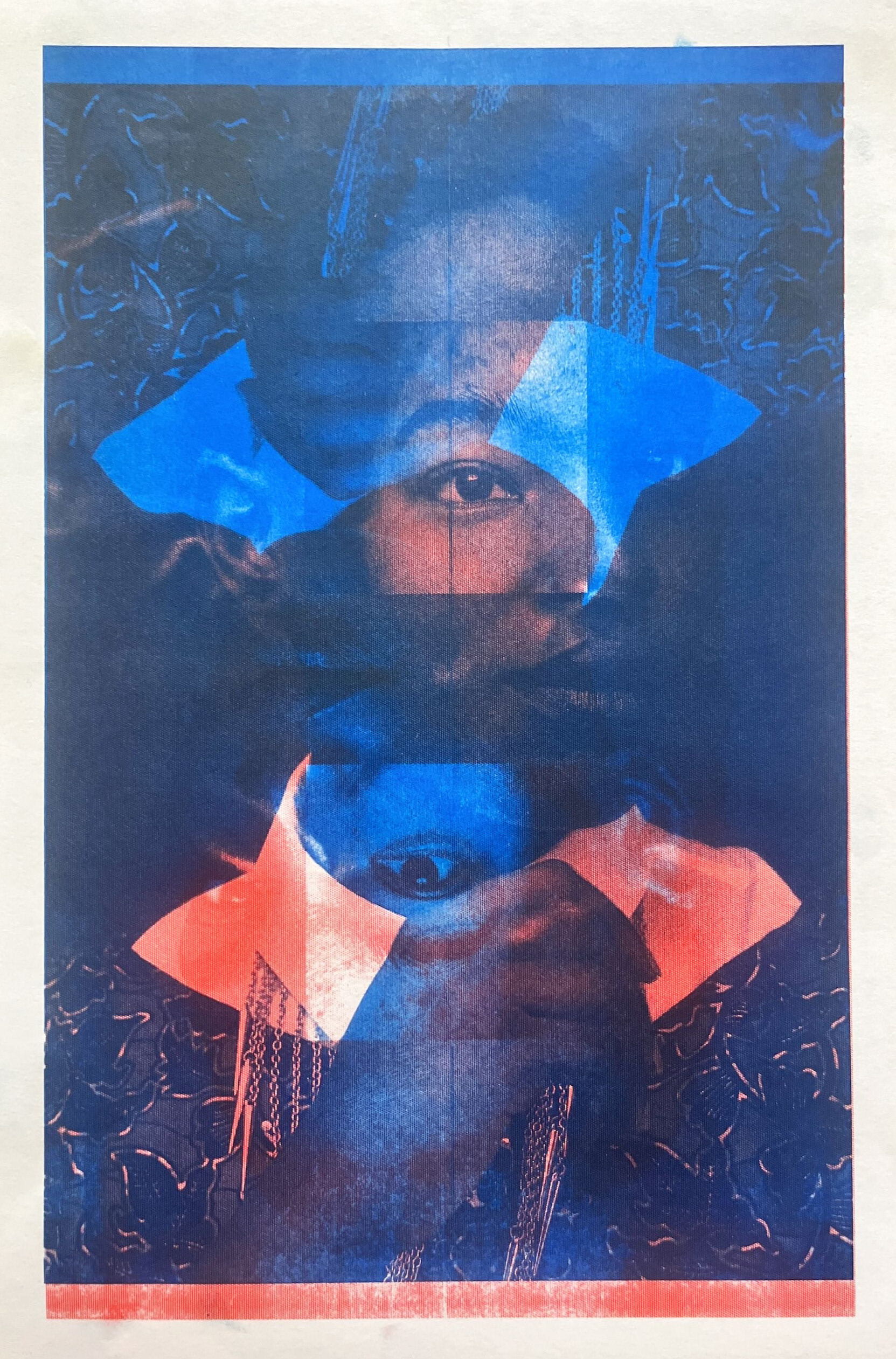
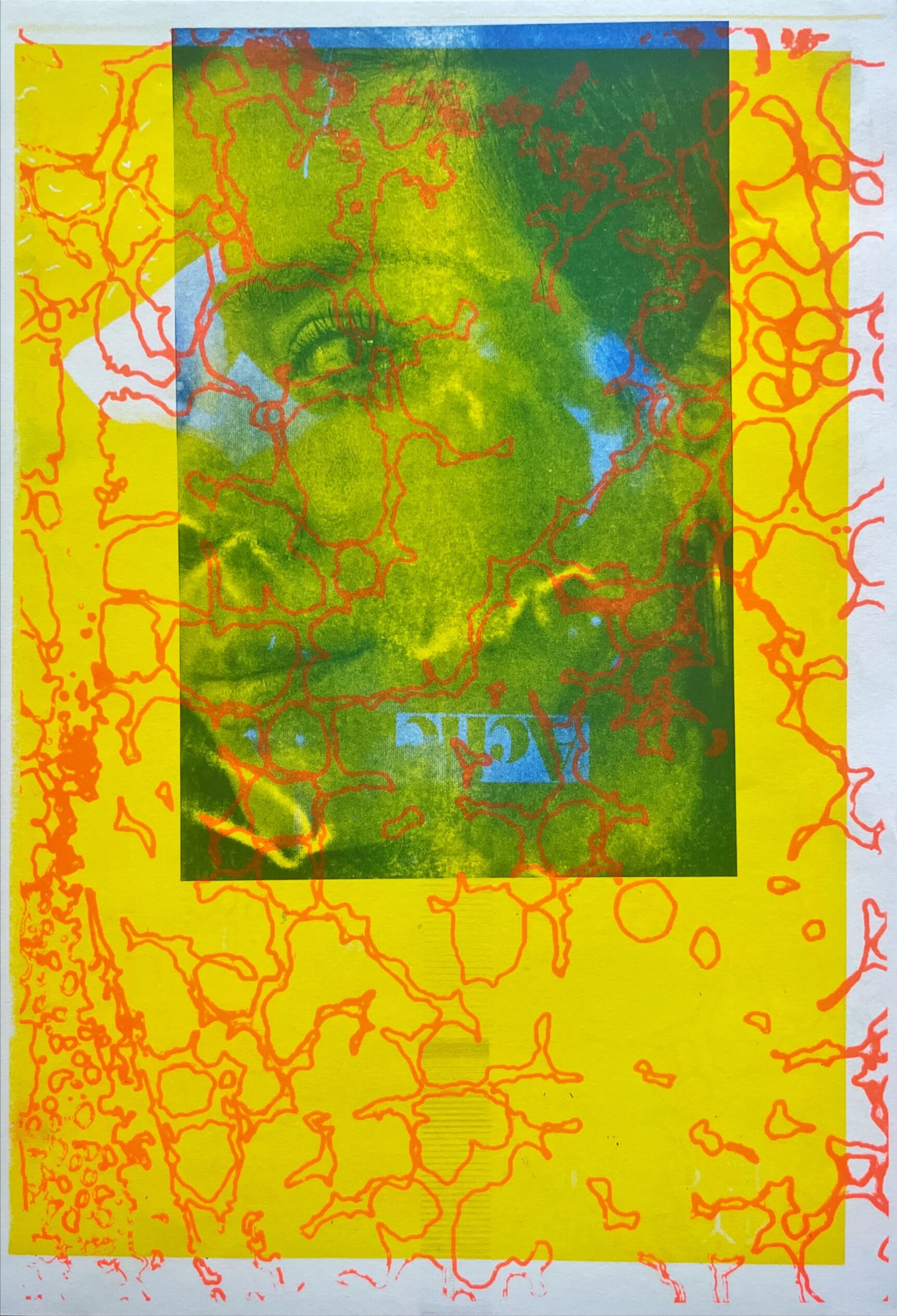
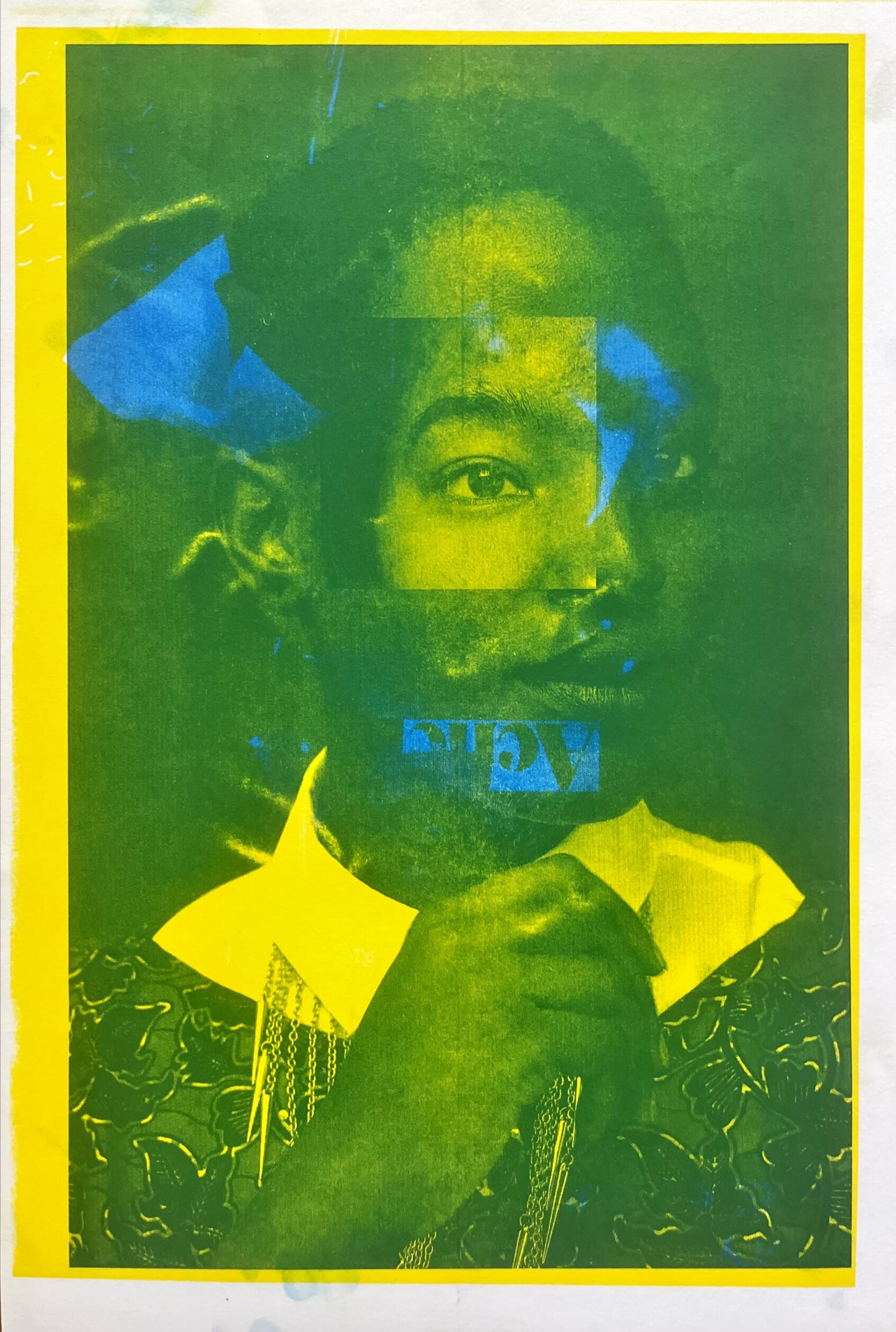

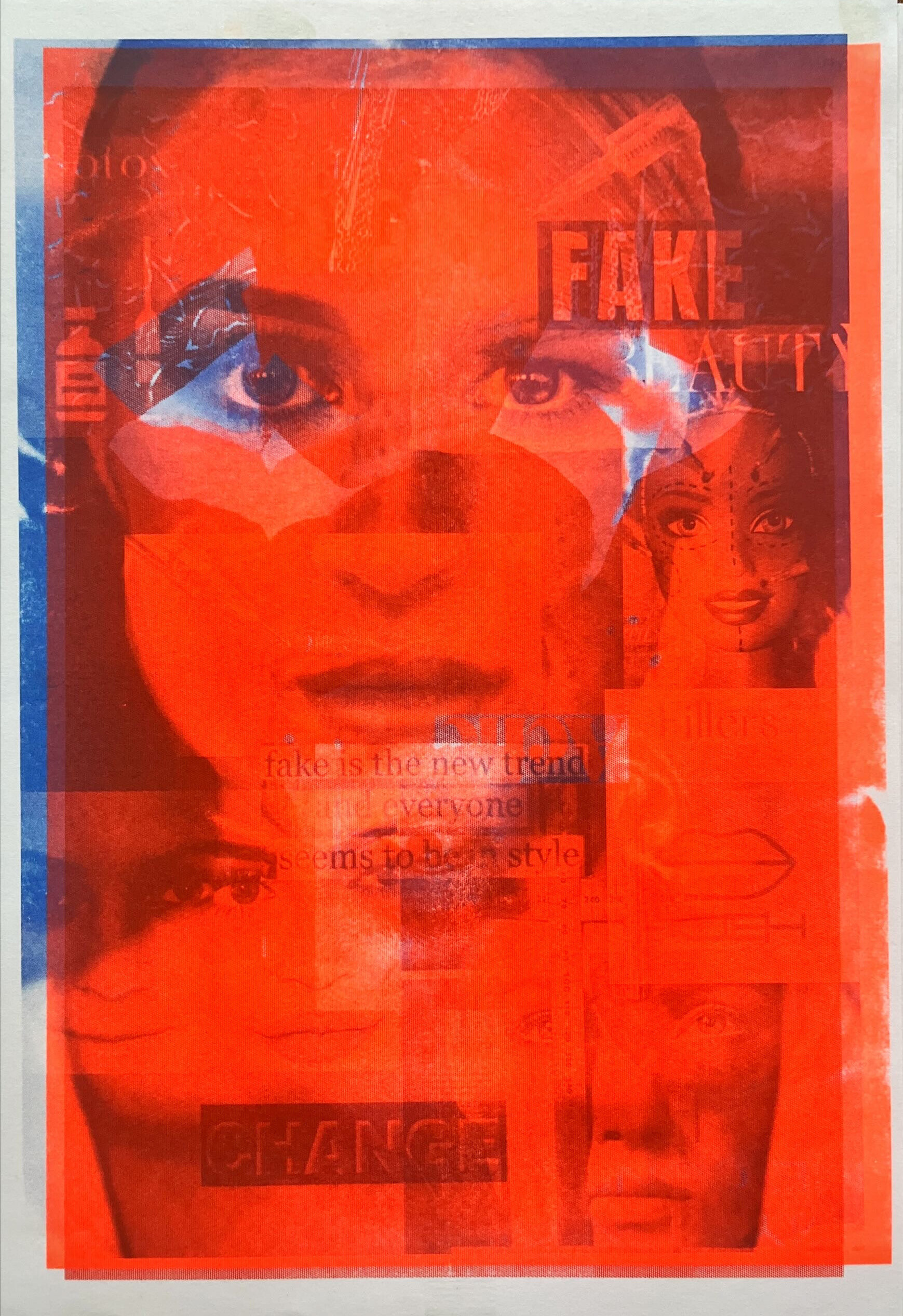

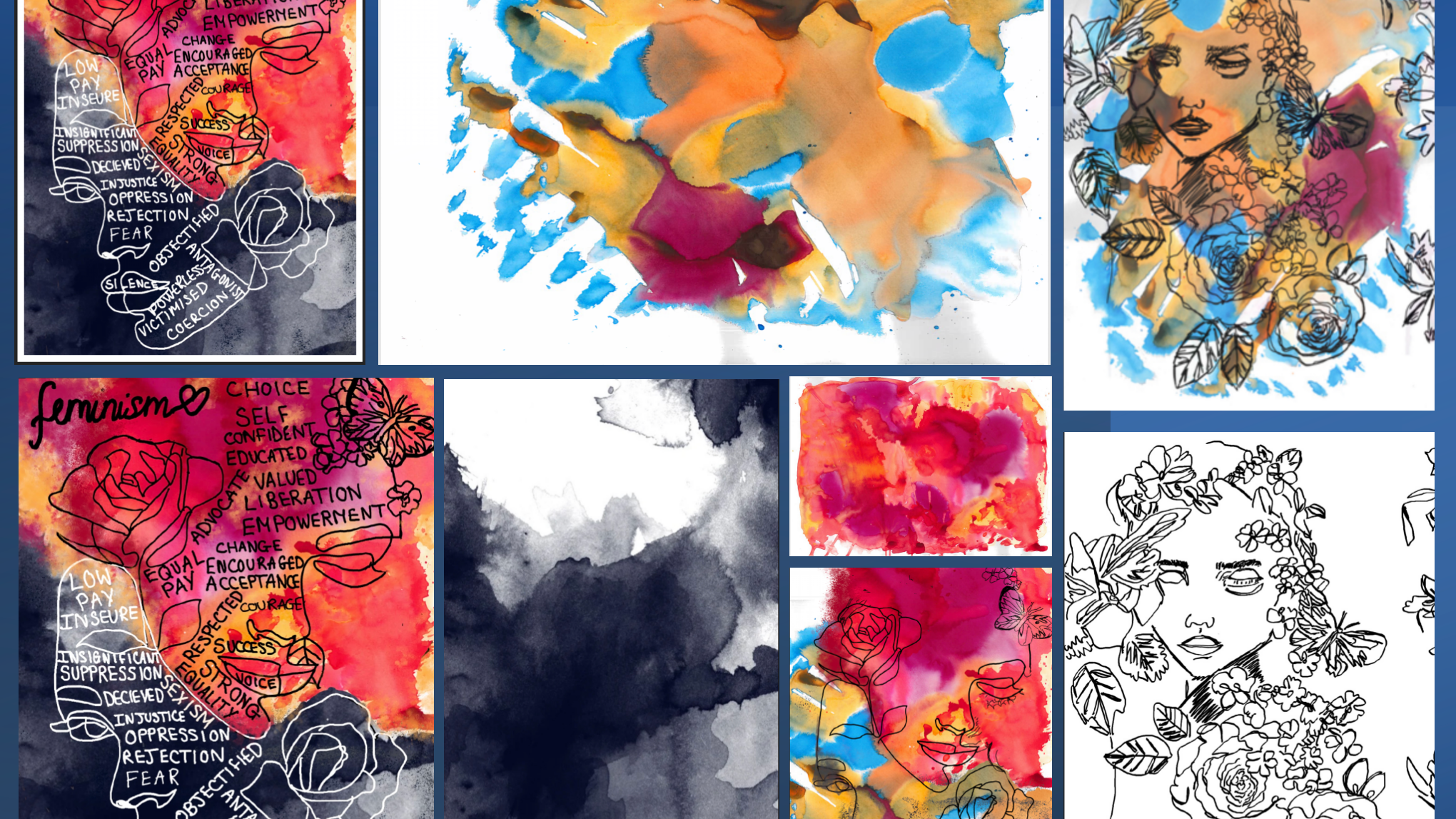
This series of Risograph posters was created as part of a self-initiated project at the end of my second year. The project explores the theme of judgement, focusing on issues that affect young people today, including acne, social media pressure, mental health, body image, and self-perception.
Each poster combines collage, photography, and text to create bold, expressive visuals. The Risograph process enhanced the emotional impact of the work, bringing vibrant, textured energy to serious and often overlooked topics. Designed to be displayed in public or shared spaces, these posters aim to challenge harmful stereotypes and spark conversations through accessible, eye-catching design.
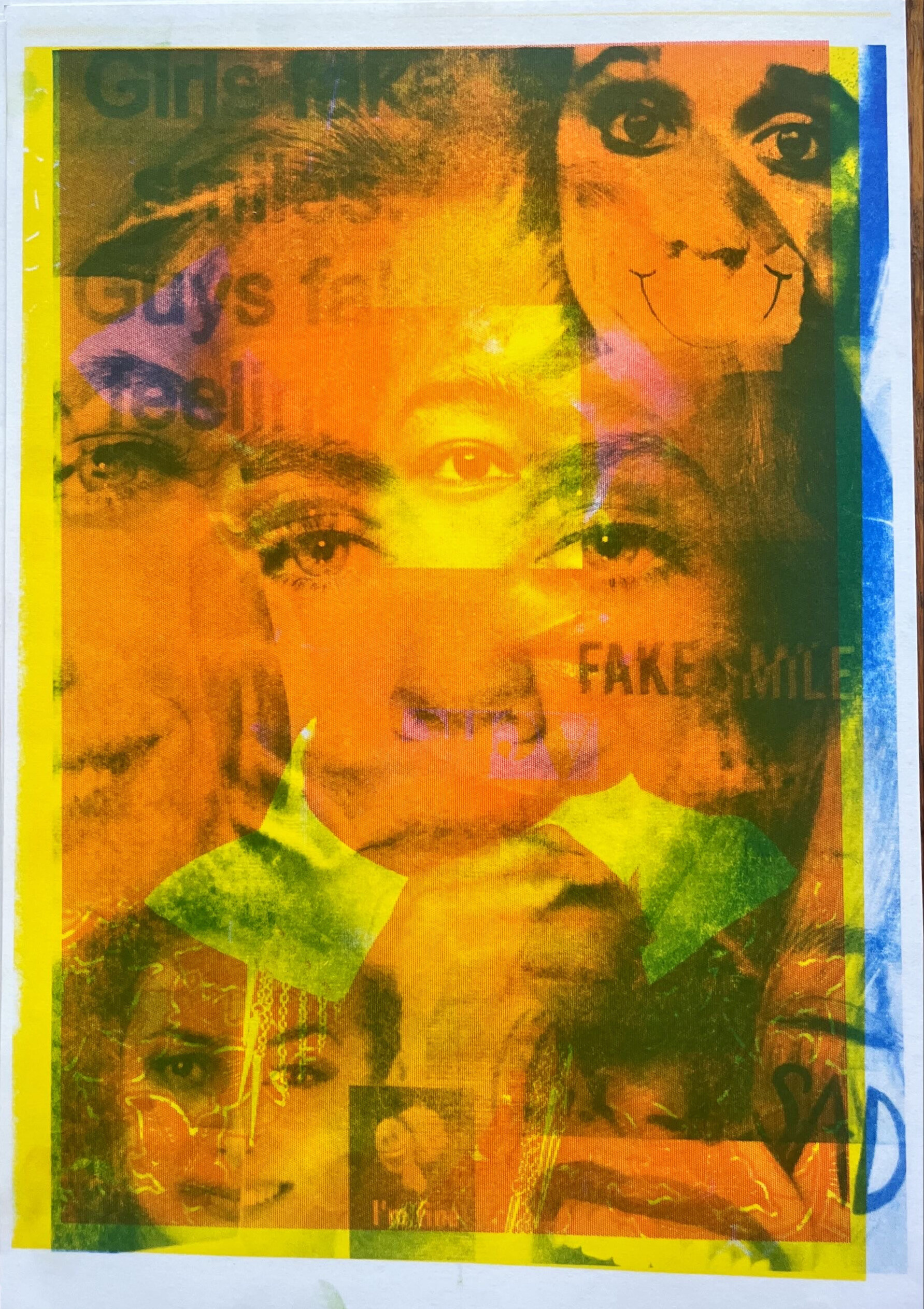
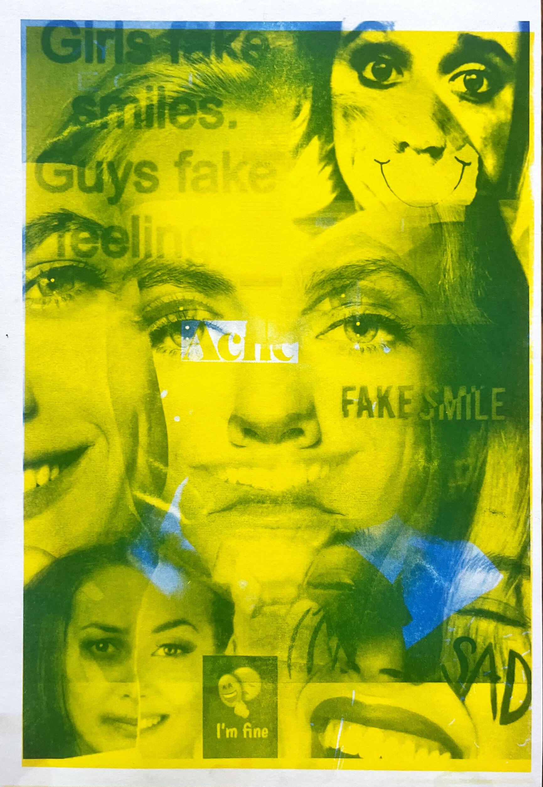
JUDGED: THE PUBLICATION -
A PRINTED GUIDE TO THE STORIES BEHIND THE POSTERS
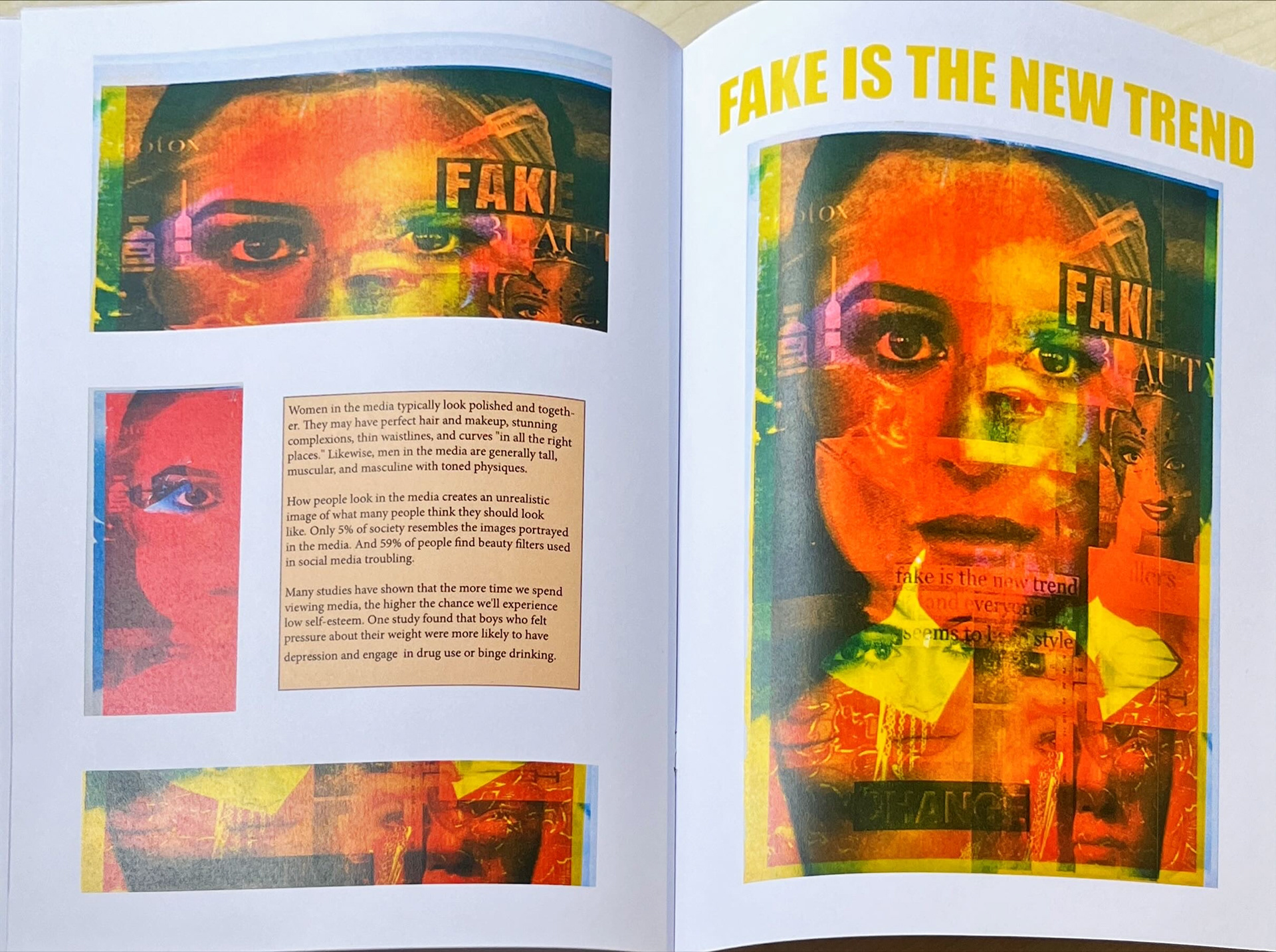
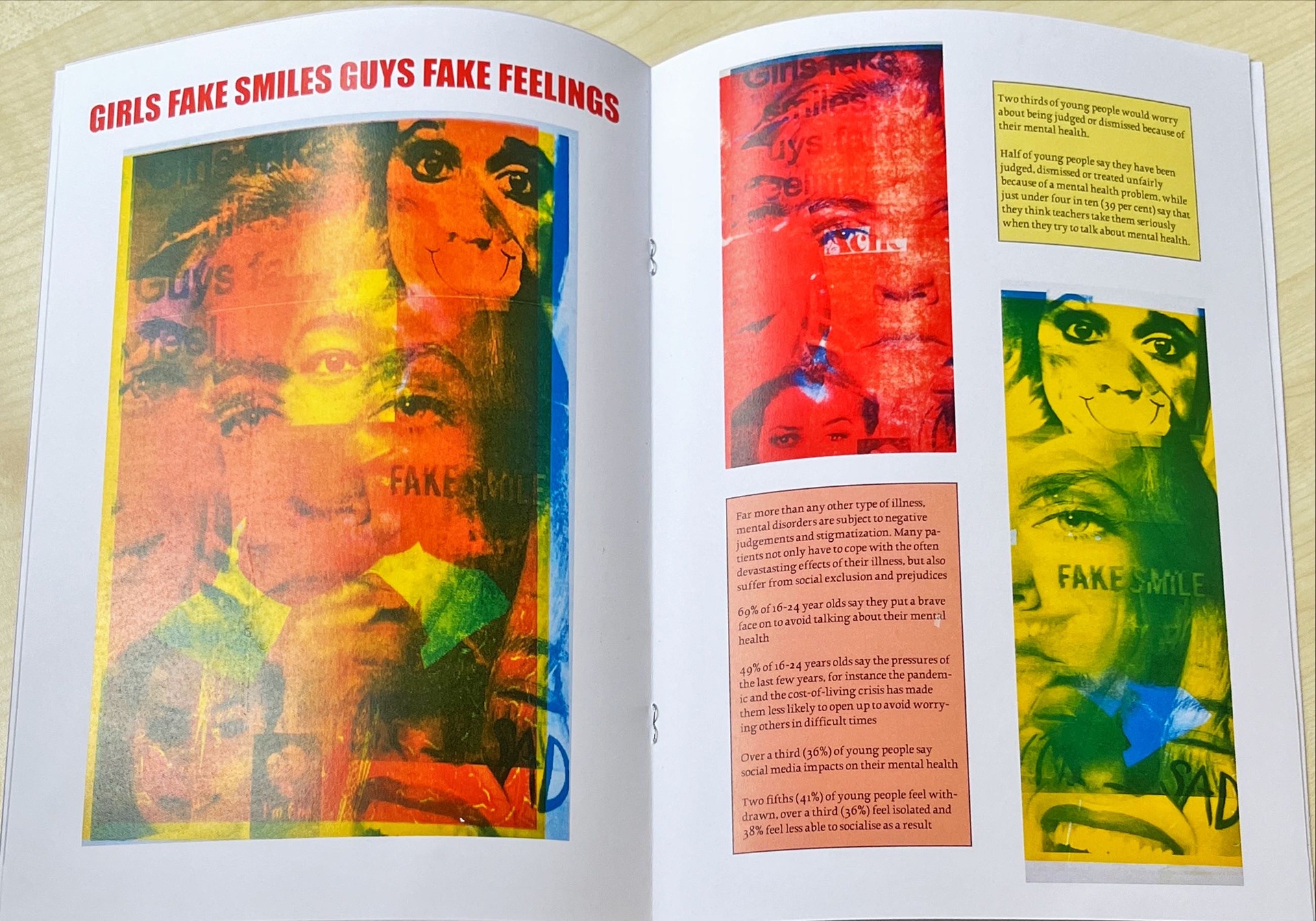
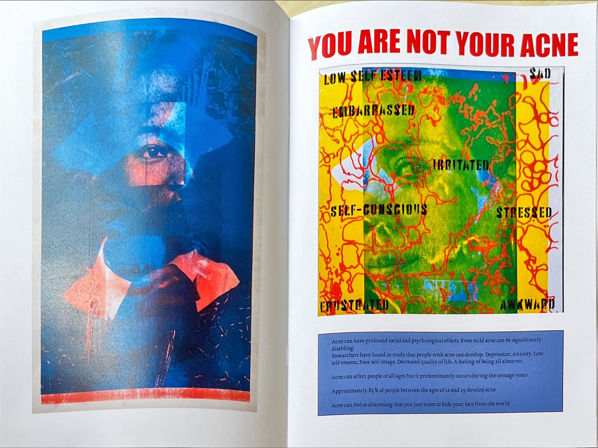

To accompany the poster series, I created a book that brings together the final designs with supporting context. Each section of the publication includes one of the posters, along with researched facts, statistics, and insights related to the subject it addresses. Printed and laid out as a visually rich magazine, the publication is designed to inform as well as engage, offering readers a deeper understanding of the issues behind the artwork.
The format reflects the balance between emotional impact and educational value, making the project both expressive and purposeful.
SALOMÉ–PLAY PROJECT -
RISOGRAPH POSTER SERIES

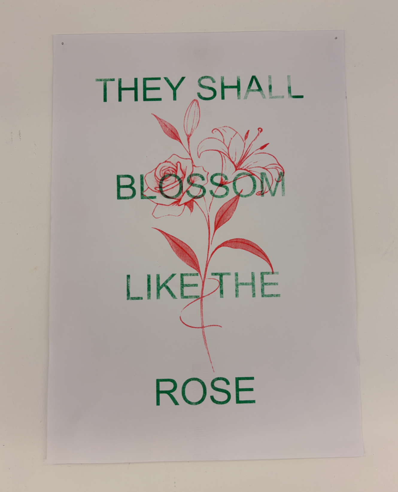
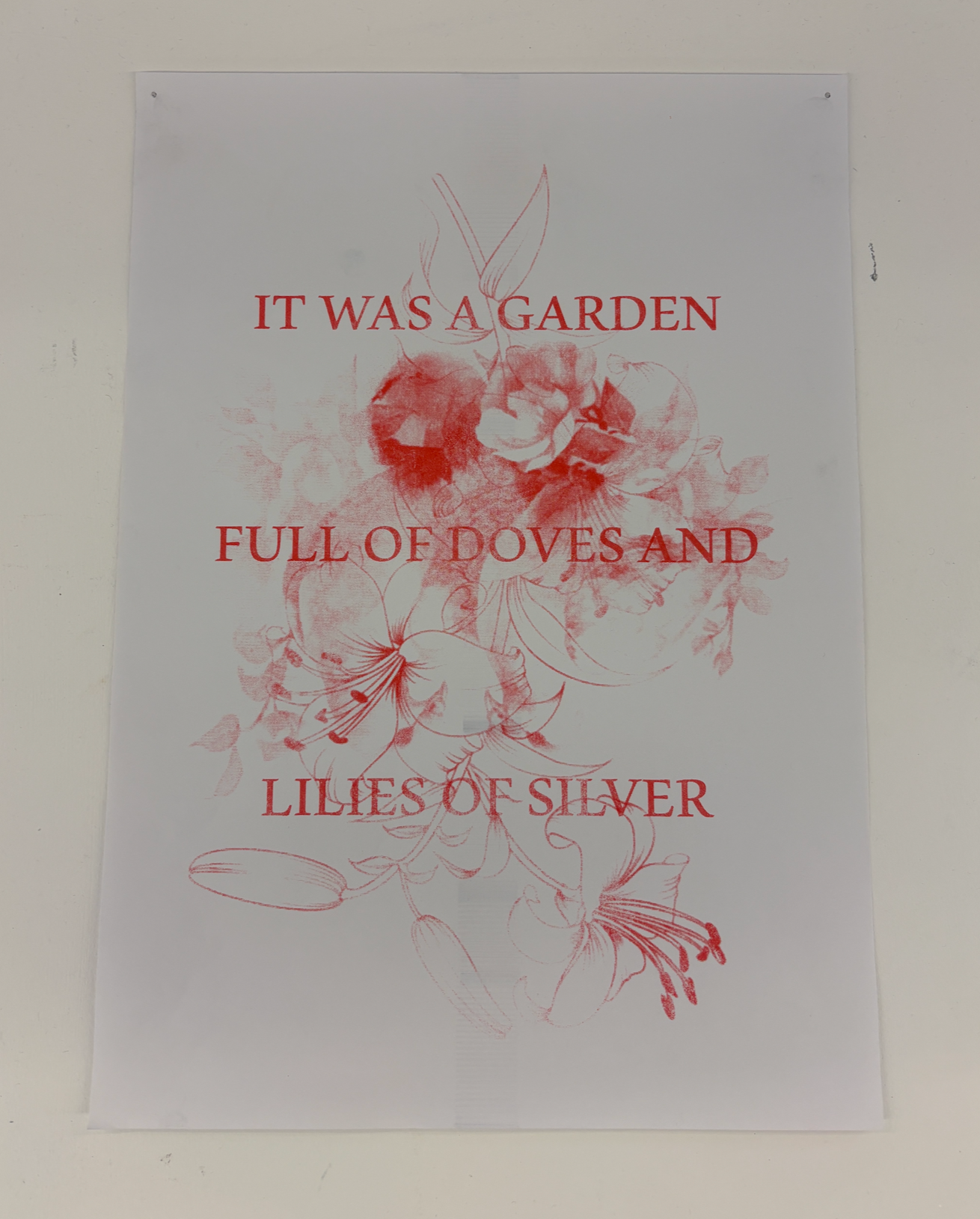

These posters were created for the Salomé play project and exhibition, where I once again utilised Risograph printing, as it consistently complements my practice and effectively captures the essence of the play. By layering quotes and imagery from the production, I crafted designs that are both simple and striking, creating a bold visual impact when displayed.
The concept focuses on the recurring theme of nature throughout the play, translating this idea into a visually dynamic format. The combination of vivid graphics and thoughtful design helps evoke the atmosphere of Salomé, creating a powerful connection between the narrative and the audience.
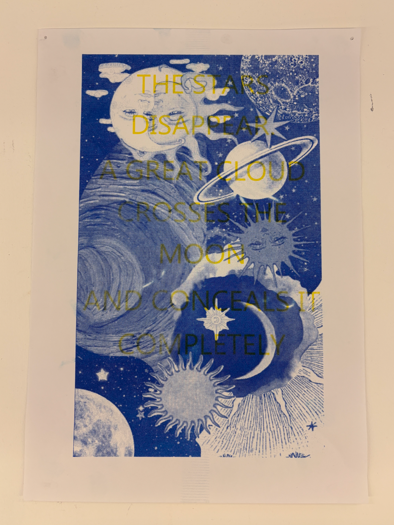
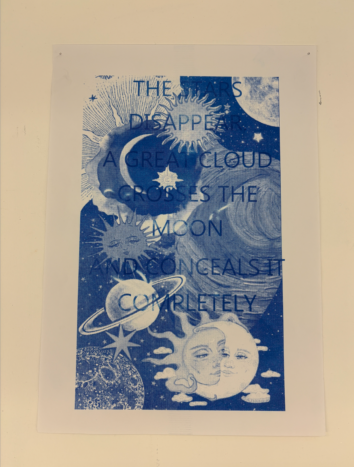
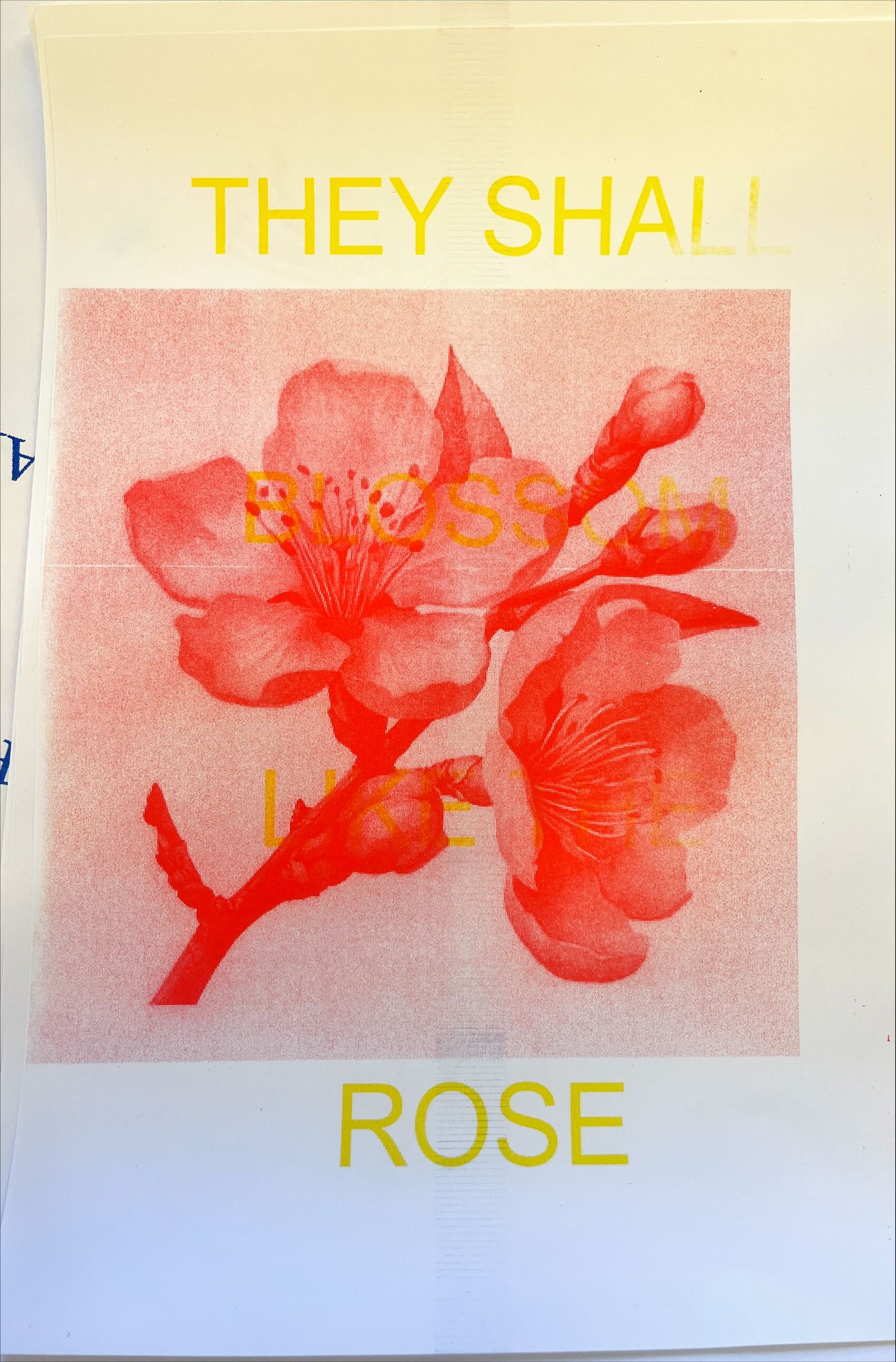
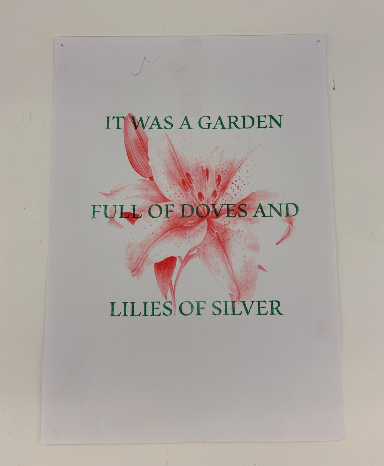
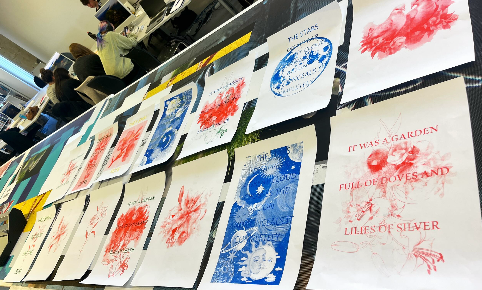
CERN PROJECT -
POSTERS & MOVING IMAGE DESIGN

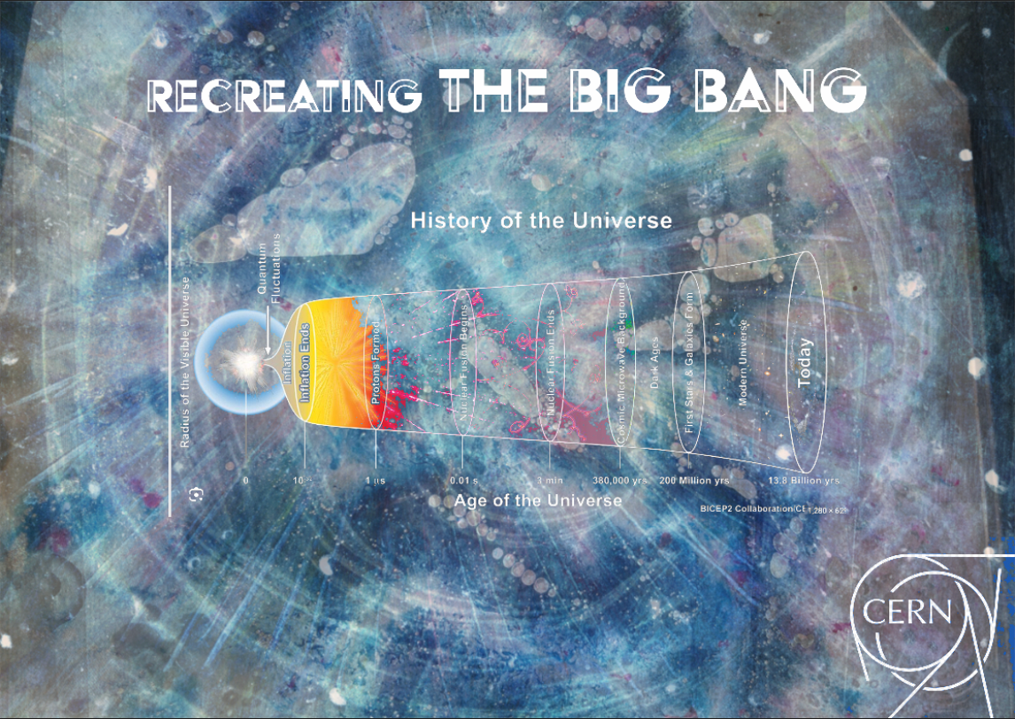
This project was part of a collaborative brief inspired by the groundbreaking scientific experiments at CERN. My aim was to interpret these complex ideas through a visual, design-led approach, translating scientific themes into immersive, expressive artwork.
I began by experimenting with pouring paints, watercolours, and mixed media to create abstract, cosmic-style textures. I also explored the interaction of materials by projecting and mixing them live on a large screen, capturing the unpredictable patterns and organic movement that emerged. These projections became a key part of the design process, I incorporated stills and textures from them directly into the poster compositions, adding depth and energy to the final visuals.
The resulting posters are bold and atmospheric, evoking the mystery and beauty of space and scientific discovery through layered imagery and striking colour palettes.
In addition to the print work, I created a moving image piece that expands on these visuals, using motion, colour and fluid transitions to fully immerse the viewer in this space-inspired environment. The final outcomes reflect my interest in blending traditional media with digital techniques to explore science through a creative lens.